
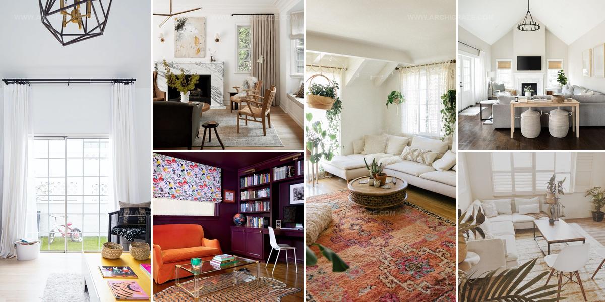
20 Elegant Window Treatments That Refresh Your Living Room

Window treatments can completely change how a beautiful living room looks and feels when sunlight streams through each morning.
The right fabric, style, or material makes any space more inviting while solving practical problems like privacy and light control.
Rooms gain personality through careful selection of what hangs above the glass, whether bold patterns make a statement or neutral tones create calm.
Function matters just as much as appearance since window coverings need to work with how people actually use their space throughout different seasons.
Simple changes to what frames the view outside often have dramatic effects on mood and comfort levels inside.
Smart choices reflect personal style without overwhelming other design elements already in place.
Browse through fresh approaches that help make any room feel exactly the way it should for the people who spend time there.
Translucent Fabric Light Flow
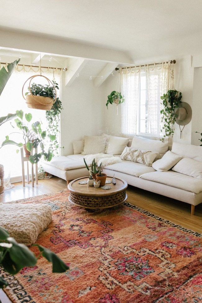
Sheer curtains offer a beautiful solution if you want to enjoy walls without heavy coverings, and they work wonderfully for anyone who values an open feel while still maintaining privacy.
Unlike solid drapes that can make rooms feel heavy and dim, these lightweight fabrics allow natural light to flow through while keeping your space bright and airy.
Sara Toufali's living room at Black and Blooms demonstrates just how well this approach handles the balance between shelter and visibility.
You get the protection you need from outside eyes without sacrificing the openness that makes a room feel welcoming.
The translucent quality means sunlight still reaches your furniture and floors, keeping everything warm and inviting.
Light passes through the fabric in a way that softens the harshness of direct sun while maintaining your comfort inside.
This style works especially well if you prefer minimal visual clutter on your windows and want to let your wall color or wallpaper be the real star of the room.
Striped Curtains Hide Everything
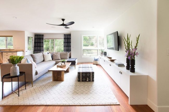
Patterned curtains with bold stripes instantly change how a room feels, and J Designs shows us exactly how to make this work in your home.
Designer Jamie Nusser selected a thicker striped fabric in neutral tones that adds visual interest without overwhelming the space.
Since the homeowners had children, the patterned curtain solved a practical problem too-it hides marks and stains far better than plain white linen would.
Beyond function, these window treatments bring warmth and comfort to the room while maintaining a relaxed, casual vibe
The thick stripes add enough personality to lift the room without needing other bold accessories to balance it out.
If you're considering patterned curtains for your own place, this approach proves that choosing the right repeat pattern makes all the difference.
Roller Shades Bay Window Perfection
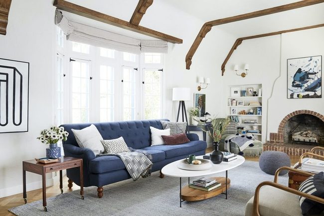
Bay windows demand special attention when you're picking out shades, and roller shades happen to be one of the smartest options available.
Rather than letting awkward gaps of empty space eat away at your room's appeal, these shades hug the window's natural contours and actually draw out what makes the shape so appealing in the first place.
The trick is matching your window's design to the right treatment, and you'll notice how much more polished your living room becomes.
Roller shades work well here because they follow the lines of bay windows without fighting against them.
When you select treatments that respect your window's actual shape, you solve two problems at once: hiding unwanted gaps and highlighting a key architectural feature.
It's one of those simple fixes that makes a real difference in how put-together your space feels.
Soft Yellow Curtains Over Wood
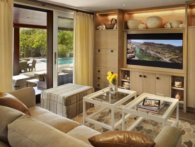
If you're looking to refresh your living room, consider going monochromatic with warm tones like Marguerite Rodgers did by installing soft yellow curtains in an all-wood space.
Wood furniture and fixtures already set a natural brown foundation, so adding yellow drapes brings out the warmth without making the room feel cold or empty.
When you stick to similar color families across your walls, furniture, and fabrics, the space feels unified and calm.
Your eye moves smoothly from one surface to another because the colors play nicely together.
Light yellow especially works well against dark wood because it brightens the room and keeps everything from looking too heavy.
This approach keeps the space from feeling plain since the different shades and textures of wood and fabric add depth and interest.
You get a polished look that feels relaxed and put-together at the same time.
White Matchstick Blinds Light Control
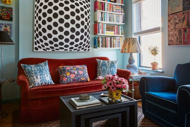
Blinds don't have to be boring relics from the past, and it's time we rethink how we use them in our homes.
Designer Tara McCauley points out that white matchstick blinds can bring a polished, refined quality to any living room.
She loves how they let light filter through while keeping the space looking clean and put-together.
What makes them special is their flexibility-they fit equally well in traditional settings and contemporary spaces.
You get that balanced aesthetic without sacrificing brightness, which matters when you're trying to keep a room feeling open and airy.
These blinds add just enough structure to anchor a more playful decorating style without overwhelming the overall look.
Whether your taste leans classic or modern, they offer that finished, tailored appearance that pulls a room together naturally.
Fuchsia Walls Orange Settee Connected
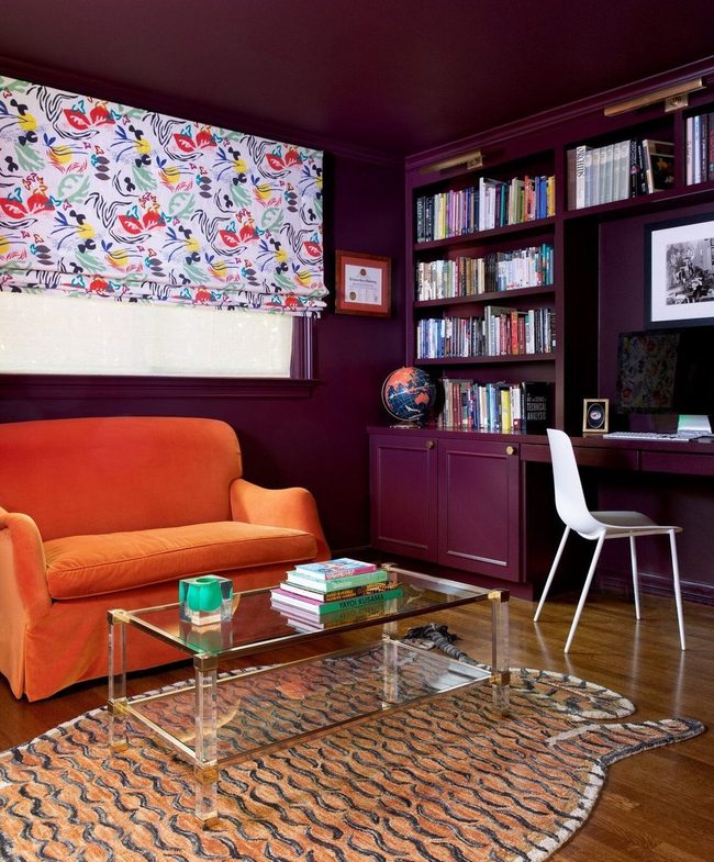
Mary Patton's approach to window treatments speaks to those who embrace the "more is more" philosophy, and her living room design proves why this works so well.
Hot fuchsia walls and ceilings already command attention on their own, but she pushed the visual drama further by adding a bright orange settee that bounces the energy around the room.
Multi-colored roller shades then bridge these two bold hues together and tie the scheme into one satisfying whole.
You'll notice how each color choice reinforces the others instead of competing for your attention.
She understood that when you layer this many vibrant tones, they need something to help them relate to one another.
Those shades do exactly that, acting as a unifying element throughout the space.
If you love color and want to go bold in your own home, this room shows you can absolutely go all in without things feeling chaotic.
Just make sure your eye-catching pieces connect through repeating tones and shared textures.
Floor-To-Ceiling Curtain Elevation
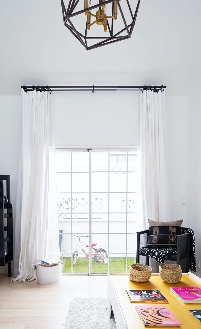
When it comes to window treatments, where you hang them matters just as much as what you choose, and positioning your curtains from the ceiling all the way down to the floor rather than stopping at the window frame makes an enormous visual difference.
Extending the rod beyond the window on both sides gives your curtains somewhere to sit when they're pulled back, and this technique works whether you have tall ceilings or want to make your walls feel higher than they actually are.
Going wide with your curtain placement and letting them rest on the sides of the window wall creates clean lines and draws attention upward throughout the room.
You don't need fancy fabrics or expensive hardware to pull off this effect-the placement itself does most of the work.
Even simple curtains hung this way look polished and well-designed.
This simple adjustment makes such a difference that I recommend it to anyone wanting to improve how their windows look without spending much money.
It's one of those tricks that feels small but changes how the whole room feels immediately.
Dual-Layer Window Light Control
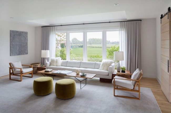
Hanging two layers of fabric at your windows opens up a world of possibilities that goes far beyond what a single layer can do.
You get to control exactly how much light filters into your space, and that's genuinely useful when you want brightness during the day but darkness at night.
Beyond the practical side, double-layered drapery adds a lot of visual richness to any room and makes your windows feel more complete.
One layer can be sheer to let soft light through, while the other provides actual coverage when you need it.
This setup works well in living rooms where you spend time relaxing and want options.
Designer Allison Babcock points out that this approach gives you serious flexibility with light management, which beats struggling with a single panel that doesn't quite do what you need.
It's one of those solutions that looks great and performs well at the same time.
Black Drapes Transform White Spaces
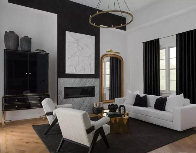
Black drapes can transform your living room in ways that might surprise you, and Studio KT's work shows just how powerful this choice can be.
While most people stick with white curtains in their living rooms, designer Kara Thomas decided to shake things up by adding thick black drapes to an otherwise mostly white space.
The contrast creates something dramatic rather than dark or dreary.
You get a bold visual statement that makes the whole room feel more sophisticated and interesting.
The black fabric draws attention immediately and keeps the space from feeling too plain or predictable.
If you're tired of playing it safe with typical window treatments, this approach lets your personality shine through.
Going darker with your curtains doesn't mean your room will feel smaller or less bright during the day.
Instead, you'll find that the contrast actually makes your space feel more intentional and polished overall.
Emerald Sofa And Drapes Unity
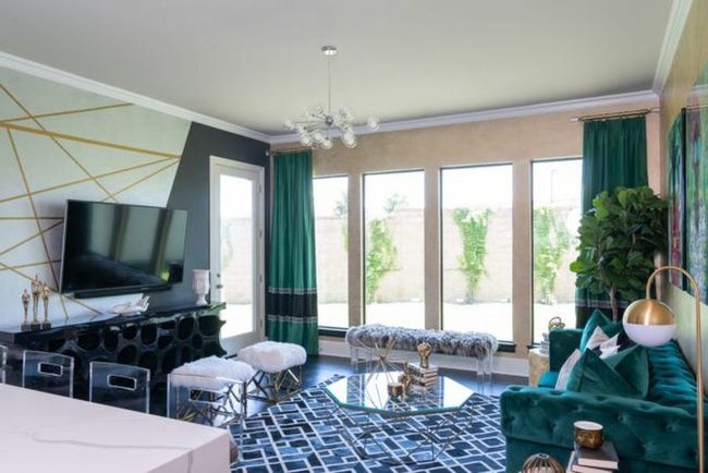
Matching your drapes to your couch gives you a balanced look that stands out without taking over the whole room
Emerald green curtains paired with a similar green sofa grab attention right away because of their rich color and size.
Since both pieces share the same shade, they speak to each other across the space instead of competing for dominance.
You get that bold pop of color you want without things feeling chaotic or mismatched.
Dark green fabrics bring depth and sophistication to any living room without demanding all the focus.
Linking your largest furniture pieces this way keeps everything feeling connected and planned.
It's a simple strategy that lets you go bold while still maintaining harmony throughout your space.
Matte Black Rods Stark Contrast
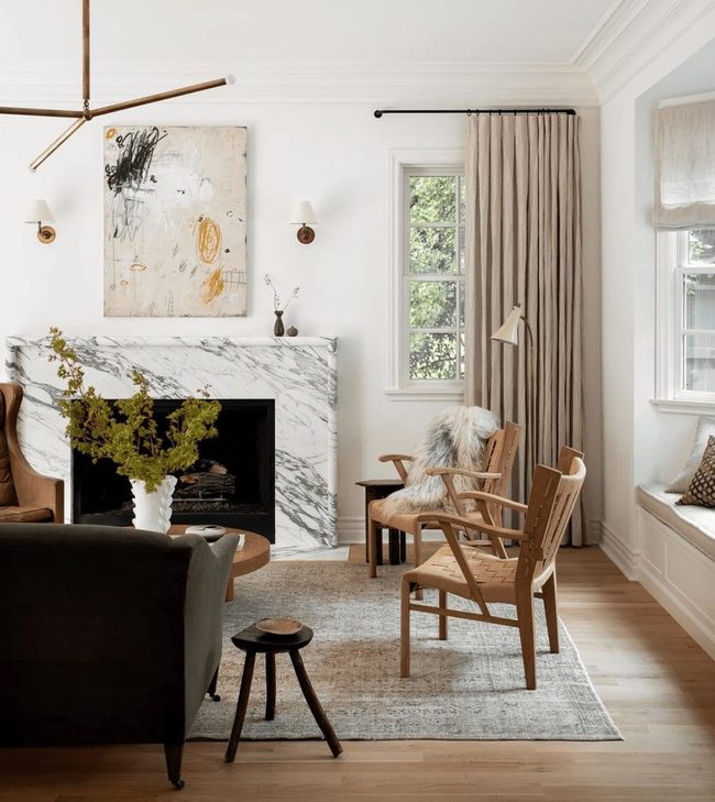
If you like neutral spaces but white alone feels too plain, consider what Katie Hodges did in her living room by pairing white walls and furnishings with warm taupe drapes that add softness without straying from a calming palette.
She installed matte black rods to hang those curtains, and the dark metal against the light fabric creates a striking visual contrast that prevents the room from feeling flat or one-note.
This simple swap of adding darker hardware makes those drapes stand out in a way that plain white curtain rods never could.
You don't need bold colors or busy patterns to add interest to a neutral room-sometimes the smallest choices like switching up your rod finish make the biggest difference.
We often overlook hardware as a design element, but it's one of those things that sits right at eye level and shapes how we see the whole space.
The matte black brings an edge that balances all that softness in the fabrics and walls around it.
Going neutral doesn't mean settling for boring, and this example shows how one intentional choice about contrast can completely shift how a room feels.
Bold Pattern Walls, Solid Drapes
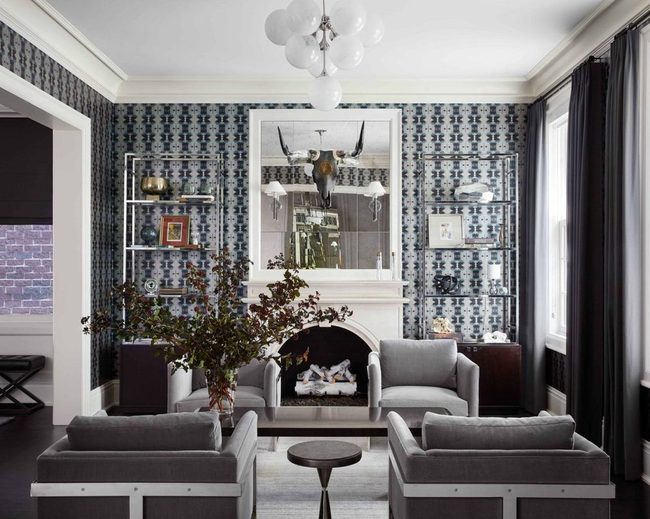
Wallpaper with a bold repeat pattern makes a big visual statement in any room, so you'll want to balance it with solid-colored drapes instead of layering multiple patterns on top of each other.
Mixing too many prints together-like a playful wallpaper paired with patterned curtains-creates visual chaos that's hard on the eyes.
Designer Dan Rak shows how simple this solution really is by keeping the window treatment plain and letting the wall take center stage.
When you choose solid drapes, they act as a calm backdrop that lets your patterned walls shine without competing for attention.
This approach keeps your space feeling organized and put-together.
Go ahead and embrace that bold wallpaper you love, but remember that restraint elsewhere in the room helps it work better.
You don't need every surface covered in pattern to make a room feel designed and complete.
Sometimes the smartest move is knowing when to step back and let one strong element do all the heavy lifting.
Soft Color Fade Curtains
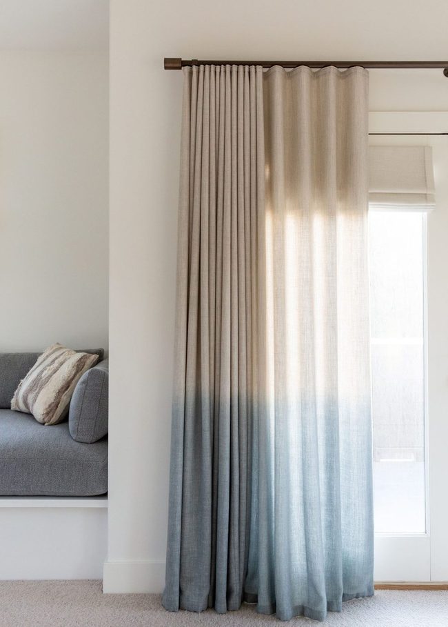
Ombre curtains offer a great middle ground if you want something more interesting than plain fabric but don't want bold patterns taking over your space.
By choosing a set that gradually shifts from one shade to another, you keep things simple while still adding visual depth and softness to your windows.
Pair these gentle color transitions with bright white walls so the curtains become the star without overwhelming the room.
This approach works well for anyone who prefers restrained style but still wants their space to feel layered and thoughtful.
You can find ombre options in many color ranges, from cool blues that fade to white or warm neutrals that transition beautifully.
Many designers pair these curtains with minimalist furniture and clean lines to let the fabric's gradient really stand out.
Since the color change happens gradually across the fabric, your eye naturally moves across the window in an interesting way.
It's a smart choice when you want something beyond basics without the commitment of a large print or pattern.
Bubblegum Pink Meets Mint Green
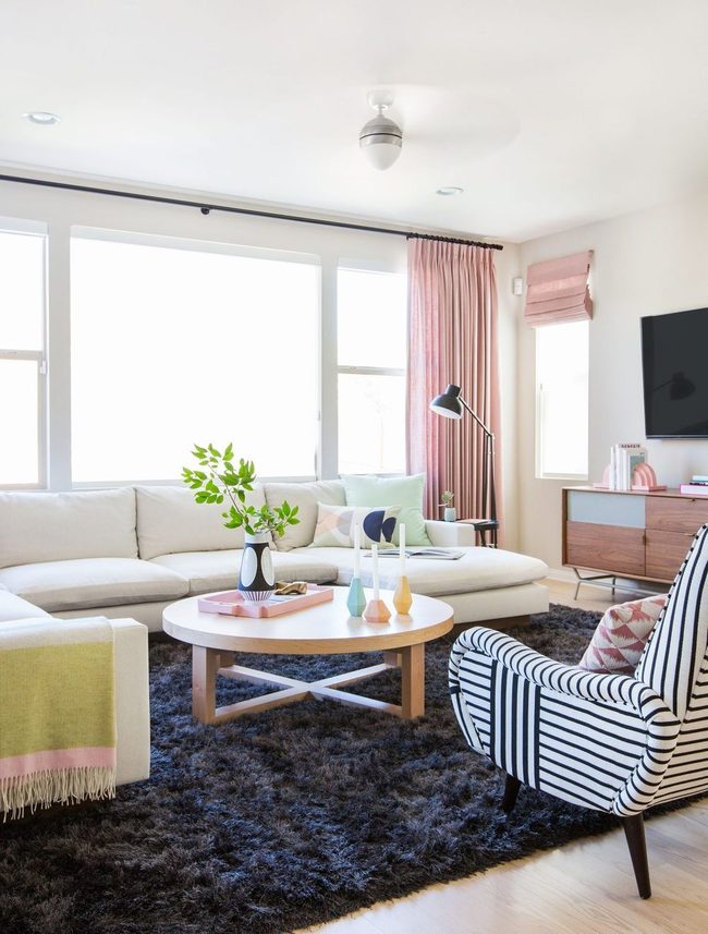
If you have an all-white room that needs some life, pastel curtains offer one of the easiest transformations available.
Designer Emily Henderson brought warmth to a living space by layering in bubblegum pink drapes and bedding that immediately catch attention with their boldness.
Black and white furniture grounds the palette while mint-toned accessories add another layer of interest You can breathe easy in a space like this because the airy foundation stays intact even with the color additions.
Pink doesn't have to feel overwhelming when you balance it with neutral furnishings and quieter accent pieces.
The result feels fresh and lively at the same time, proving that small color choices can shift your entire room's personality.
Wooden Shutters Cast Geometry
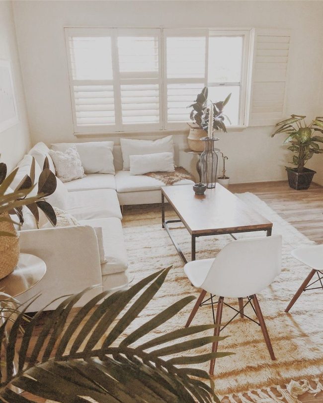
Wooden shutters frame the living room window with striking horizontal lines and natural warmth, blending seamlessly into the walls while allowing thin strips of sunlight to slice through and create geometric patterns across the space.
Ajai Guyot of True Home brings her signature approach to window treatments by pairing this understated elegance with a minimalist color scheme and thoughtful texture touches throughout the room.
She understands that sometimes the best way to make a space feel calm and restful is to strip away excess and let natural light do the work.
You don't need much when every element serves both form and function.
Light and shadow dance across the shutters as the day passes, and this simple interplay keeps the room from feeling static or sterile.
Her living room becomes a kind of retreat where clean lines and natural materials speak for themselves.
We see how powerful restraint can be when you're designing a space that truly soothes the mind and body.
Layered Neutrals Meet Cathedral Light
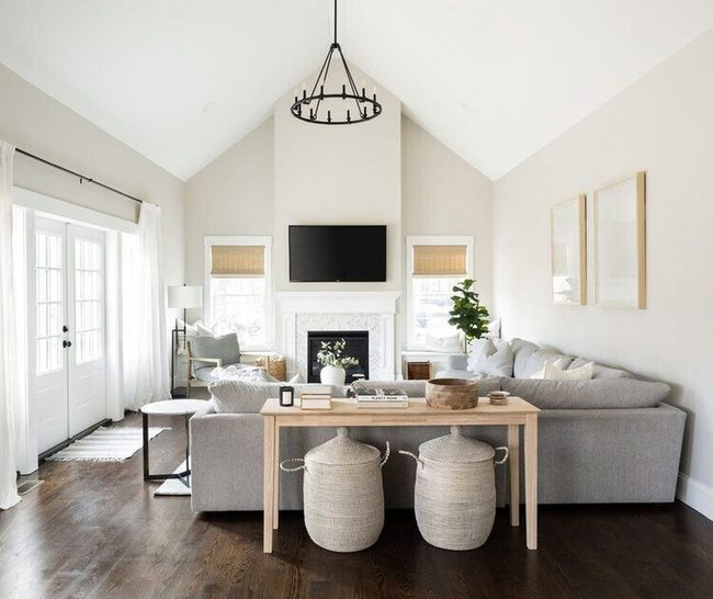
Mixing different window treatments in one room opens up so many design possibilities, and Desiree of D Burns Interiors shows us how well it works in this bright, airy space.
Natural shades paired with sheer curtains create an eye-catching combination that lets the windows stand out as a design feature while keeping all the attention on the soaring cathedral ceilings above.
Layering these two styles together gives you flexibility with light control and privacy, and you can adjust them based on the time of day or your mood.
Light floods through the sheer fabric when you want openness, yet the solid shades provide coverage whenever you need it.
Instead of choosing just one type of treatment, you get the best of both worlds with this approach You can apply this same strategy to any room in your home and customize the materials and colors to match your style.
Blue And White Trimmed Drapes
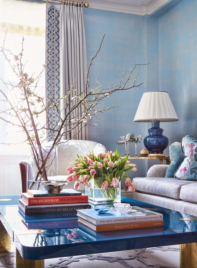
Thick drapes with bold blue and white trim instantly catch attention and demonstrate how much small choices can transform a room.
Phillip Thomas, a designer, shares a simple trick that makes window treatments look far more polished than they actually are.
You can add a printed or deeply colored trim to any fabric, and it shifts the whole feel of your space.
In this room, the trim on the drapes connects beautifully with the wallpaper and other furnishings already in the space.
What's great about this approach is that you don't need to redesign everything to get results.
Sometimes the easiest way to make a real difference is paying attention to one element and enhancing it.
It proves that when you focus on what matters, even basic updates can bring your vision to life.
Bright Orange Window Treatments
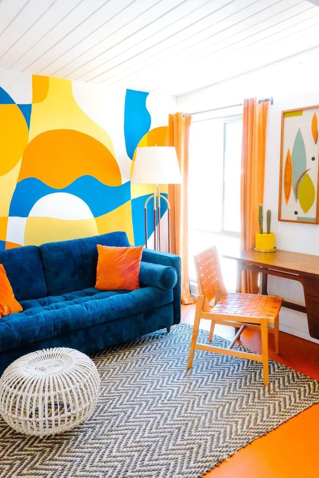
If you love color, your window treatments are the perfect place to show it off and let your personality shine through.
Danielle Nagel's bright living room demonstrates how bold hues on windows can make you genuinely happy the moment you walk in.
To prevent the space from becoming overwhelming, she scattered small orange accents throughout the room so the eye has places to rest.
You don't need to cover every surface in color to make a statement.
Instead, balance intense shades with neutral areas that give the room breathing room.
This approach keeps things from feeling chaotic while still celebrating the colors you adore.
When you layer your boldness strategically, the space feels intentional rather than random.
Blue White Geometric Window Statement
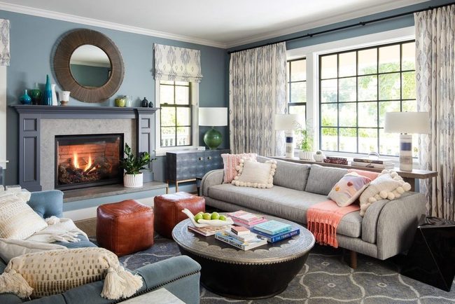
Go ahead and lean into your bolder side because patterns deserve the spotlight in your space.
Studio Munroe, a San Francisco design firm, proved that you can use eye-catching window treatments without overwhelming the room around them.
In this example, the striking pattern on the windows pulls your gaze right in, and the blue and white colors keep everything feeling calm and balanced rather than chaotic.
You don't need to tone things down just because you want personality in your decor.
Bold patterns actually work best when you pair them with a restful color scheme, which is exactly what happened here.
Structured Drapes Meet Modern Pattern
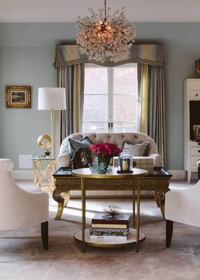
Going back to vintage styles can refresh your living room in unexpected ways, and pairing traditional drapes with a formal valance brings that classic charm right into your space.
You don't have to worry about your room looking dated or stuck in the past since modern updates can easily blend with these timeless pieces.
Designer Tom Stringer showed us how to balance old and new by adding a bold, color-blocked pattern that keeps the traditional look feeling current and fresh.
Drapes with structure and a tailored valance have their own quiet sophistication, and this combination works especially well if you want something more formal than casual.
So if you're drawn to vintage aesthetics, this approach lets you honor that love without sacrificing contemporary style.
Your living room can feel both nostalgic and modern at the same time when you mix these elements together.
Morgan Huxley
Founder & Creative Director
Expertise
Interior Design & Bold Décor Concepts, Creative Color Applications & Artistic Details, Budget-Friendly Styling, Sustainable Design Practices
Education
Parsons School of Design, New York, NY
New York Institute of Art and Design (NYIAD)
Morgan Huxley is a designer with a passion for bold interiors that feel personal and inviting. As the founder and creative director of [Brand Name], he helps homeowners bring color, texture, and personality into their spaces. With a degree from Parsons and a decorating certificate from NYIAD, he blends artistic expression with practical design solutions.
Morgan believes that great style shouldn’t be out of reach. He shares budget-friendly tips, sustainable ideas, and creative design tricks to make any home feel elevated.
When he’s not designing, you’ll find him exploring NYC’s art galleries, street murals, and food spots for fresh inspiration.