
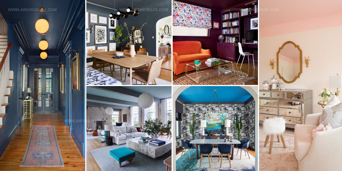
20 Painted Ceilings That Change Your Room’s Mood

Painted ceilings can change how a room feels in ways that walls alone cannot achieve.
Looking up reveals an often-overlooked canvas with tremendous potential for artistic expression and visual interest.
Homeowners frequently focus all attention on furniture and floor coverings while neglecting the expansive surface overhead.
A well-executed ceiling treatment adds depth, drama, and personality to any space without occupying valuable square footage.
The right color or pattern overhead can make rooms feel taller, cozier, or more sophisticated depending on what effect you desire.
Bold choices overhead demonstrate confidence in design while subtle approaches offer understated elegance that complements existing decor.
Monochromatic Ceiling Walls Unity
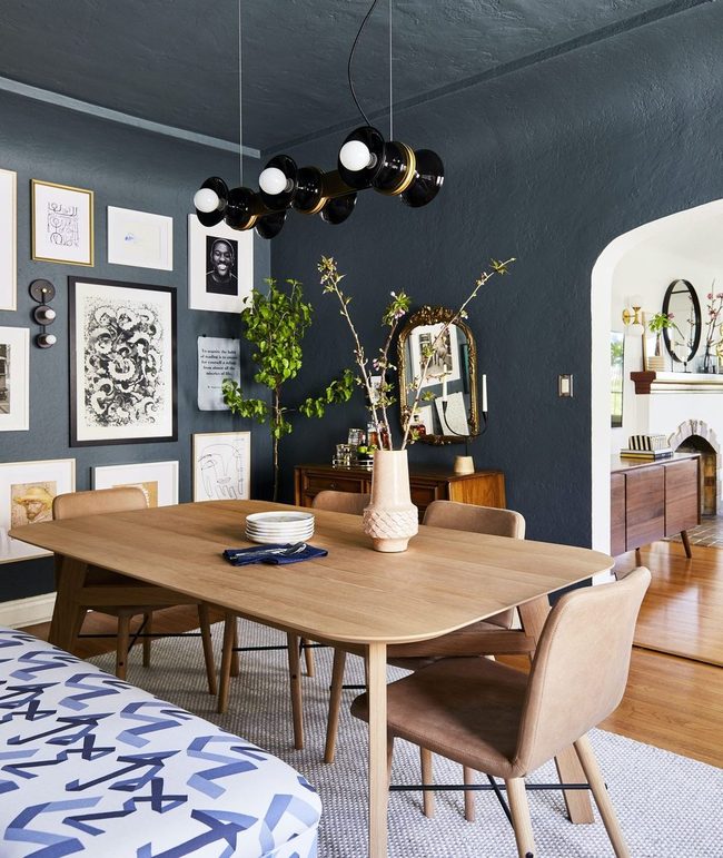
Painting your ceiling the same color as your walls might sound simple, but it's actually a smart move that pulls your whole room together without any fuss.
A dining room designed by Arlyn Hernandez for Emily Henderson shows how well this approach works when you stick with one unified color across all surfaces.
Once you've established that single-color foundation, you can layer in visual interest through other elements like a gallery wall or an ornate mirror without overwhelming the space.
Interesting light fixtures add another dimension that keeps things from feeling flat or boring.
You don't need to overthink your design plan or chase complicated trends to get results you'll love.
Sometimes the best decorating decisions are the ones that feel effortless and straightforward.
This method gives you a calm, cohesive backdrop that lets you play around with other decorative pieces in whatever way feels right to you.
Blue Ceiling Runner Lights
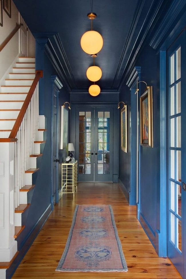
Painting your hallway ceiling is one of the fastest ways to shake off that boring reputation the space usually gets, and an all-blue painted ceiling paired with a matching runner rug creates an instant visual punch that stops people in their tracks.
String globe lights along the hallway and you've got a setup that feels both modern and welcoming, drawing attention upward and making the narrow passage feel less like a forgotten corner of your home.
We tend to overlook hallways when decorating, but this space deserves as much personality as any other room in your house.
Bold ceiling color works especially well in hallways because it catches people's attention the moment they walk through, and the reflected light from the globe fixtures adds depth that a plain white ceiling would never achieve.
You can play around with different colors depending on your style, though blue offers that cool, sophisticated touch while remaining practical for everyday living.
If painting the entire ceiling feels too bold for you right now, even a runner rug and some ambient lighting can refresh the area and make the walkway feel more connected to the rest of your home's design.
Electric Blue Ceiling Stars
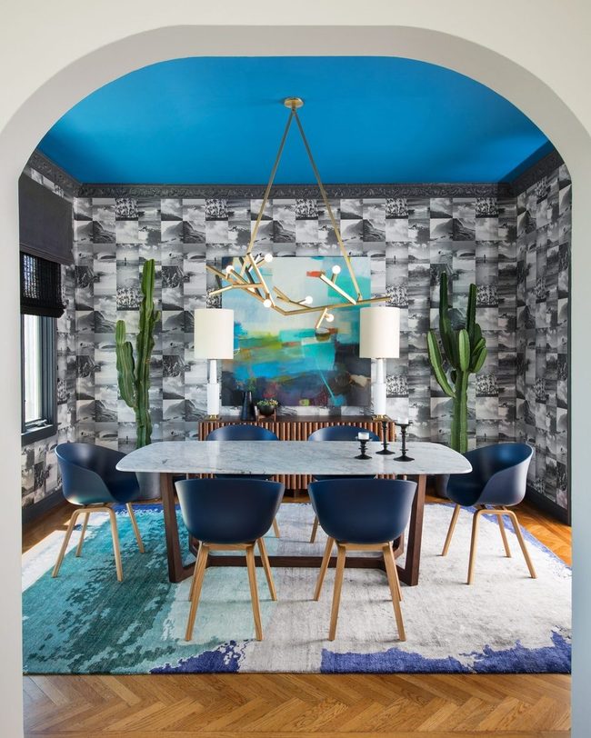
When you're deciding on a ceiling color for your dining room, don't shy away from bold choices because color can really transform the space.
One designer paired a striking electric blue ceiling with black and white patterned wallpaper, which creates an unexpected contrast that stops you in your tracks.
Midnight blue dining chairs and a matching tonal rug anchor the room below and echo the ceiling overhead.
This approach ties the bold overhead decision back into the rest of your furnishings and prevents the bright blue from feeling too isolated.
Painting your ceiling a vivid color opens up design possibilities you might not have considered before.
The electric blue example shows how a daring overhead choice can become the star of your room instead of blending into the background.
You don't need matching everything to make it work, and sometimes repeating your ceiling color in just a few pieces feels just right.
Bold ceilings are easier to pull off than many people think, especially when you connect them thoughtfully to the other elements in your room.
Lime Striped Ceiling Statement
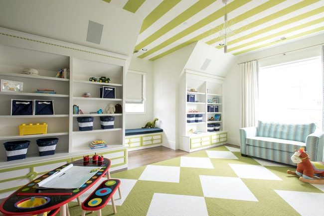
If you want to show off your daring side, consider what designer Traci Connell did in this playroom by painting the ceiling in lime green and white stripes You don't need to hold back on color if you balance it with neutral tones elsewhere, and this approach proves that stripes on the ceiling can be striking without looking too much.
Covering a ceiling in pattern is one of the most eye-catching decisions you can make in a room, and when paired with restrained wall colors, it becomes a statement rather than clashing chaos.
We see here how confidence in design means letting one feature shine while everything else supports it quietly.
Your walls don't have to match your ceiling for the space to feel put together; sometimes contrast is exactly what makes a bold choice feel successful.
Black Ceiling Brightens Wood Kitchens
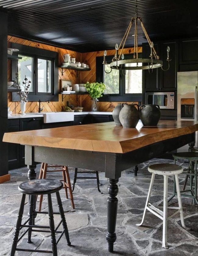
Wood paneling combined with a painted ceiling brings instant warmth to any room, so if you're working with wood walls, consider painting the overhead surface in a bold shade like black or deep charcoal.
In one country kitchen, this approach paired light-stained wood with black cabinets and window trim along with a matching dark ceiling, and the designer kept the space from feeling too heavy by using white countertops and a traditional farm sink.
You can easily brighten a dark ceiling this way and prevent the room from becoming gloomy.
Light-colored countertops reflect what little light enters the space and help balance the darker tones you've introduced.
Such contrasts-dark overhead and cabinetry against pale work surfaces-become the main visual anchor of the kitchen.
White fixtures and counters pull your eye around the room and stop it from settling on just the dark areas.
This simple mix of deep and light tones gives wood-heavy rooms both personality and function.
You won't need much else to make the space feel complete once you've established this interplay.
Magenta Walls Orange Statement Sofa
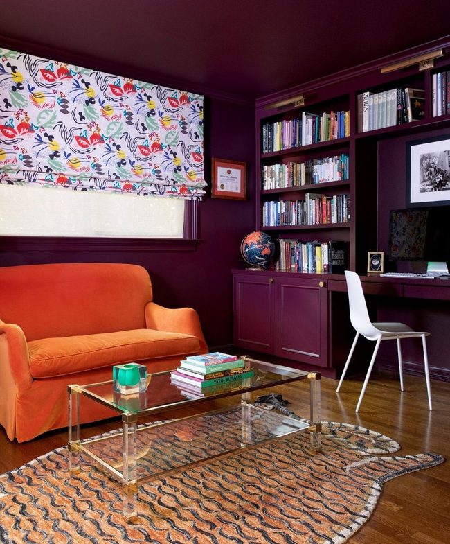
Built-in shelving and cabinetry painted in a bold magenta across walls and ceiling create an immediately eye-catching backdrop that dominates the entire room, and Mary Patton demonstrates how this monochromatic approach can feel daring rather than flat.
If you're drawn to a single-color palette, going all-in by extending the shade to every surface-including overhead and along storage units-gives the space real presence and personality.
A bright orange sofa sits within this sea of magenta and serves as the perfect counterpoint to keep things from feeling one-dimensional We often think of using one color as limiting, but this space shows how committing fully to a hue across walls, ceilings, and built-in furniture actually expands the design's possibilities.
You can apply this same principle to your own room by selecting a shade you love and then painting every surface in it, then introducing one bold accent color through furniture or art.
Soft Blue Ceiling Statement
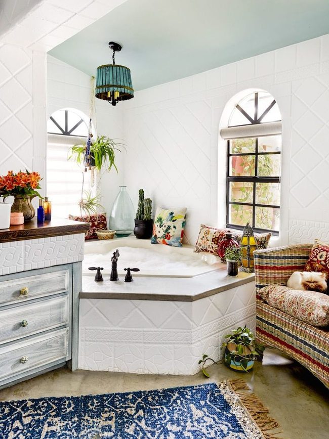
Painting your ceiling in a soft blue hue instantly becomes the most eye-catching feature in any room and sets the mood for everything else you add to the space.
Light blue works wonderfully because the color naturally connects to feelings of calm and peace, which means your whole room gets a relaxing quality from that one decision above your head.
When you want to strengthen that restful feeling, pair the blue ceiling with clean white walls and you'll have a serene bathroom that shows how simple this approach really is Your ceiling becomes a subtle statement rather than something overwhelming, and the color choice influences how you experience the entire room.
Just pick the right shade and let it do the work for you.
White Pendants Light Blue Ceiling
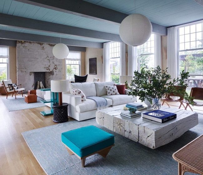
Big light fixtures hanging from your ceiling can pull attention upward and transform how a room feels, so consider adding some striking pendant lights to your space.
One living room designed by Ike Kligerman Barkley shows this beautifully by pairing white pendants against a light blue ceiling that makes the whole area look taller and more open.
We noticed they carried this color combination forward by including blue acrylic end tables and a large white sofa, which ties the room together without feeling scattered or overdone.
You can use this same strategy in your own home by picking a ceiling color that contrasts nicely with your light fixtures and then echoing those two colors in other furniture pieces throughout the space.
Pendant lights serve a practical purpose while also acting as a design element that draws the eye upward.
Keeping your main colors limited to just two or three shades helps everything feel connected and intentional.
When you repeat those colors across different items like tables and seating, the room starts to feel more planned and put together.
Mint Walls With Warm Wood Beams
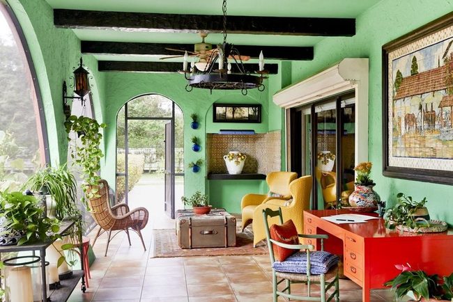
Bold ceiling colors can dominate a room, but you can also keep things simple by painting your ceiling the same shade as your walls and letting natural elements shine instead.
In this sun room designed by Rikki Snyder, the exposed wooden beams and door trim provide enough warmth that the striking mint color functions almost like a neutral background.
It might sound surprising, but this approach actually works well.
When you add an eclectic mix of furniture to the space, the room balances nicely between understated and bold, never feeling either too quiet or too loud.
The wood tones ground the bright paint and prevent it from overwhelming the eye.
You get a fresh, interesting room without needing to overthink every decision.
Sometimes the best decorating choice is knowing when to step back and let a few strong elements do the work for you.
Blue Ceiling Anchors Height
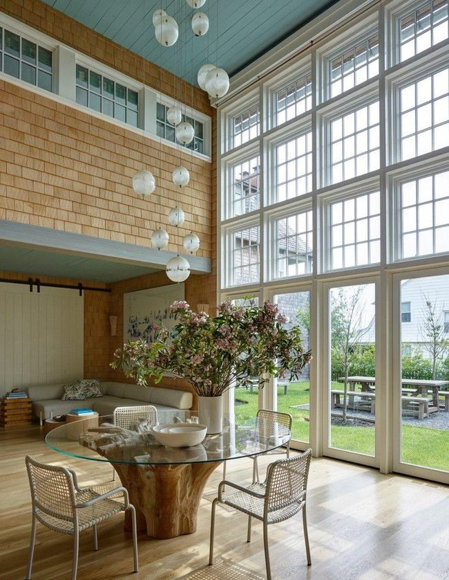
Painting the ceiling in a striking hue works well in tall spaces because it prevents the room from feeling empty or disconnected at the top.
You might find that choosing a color this vibrant makes the space feel more complete and anchors the upper half of the room When you have height to work with, don't shy away from using paint to make the ceiling count as part of your design.
Ceiling color choices often get overlooked, but they're one of the easiest ways to shift how a room feels.
This approach proves that sometimes the best way to refresh a tall room is to focus on the space above your head rather than what's directly in front of you.
Warm Gray Ceiling Uplift
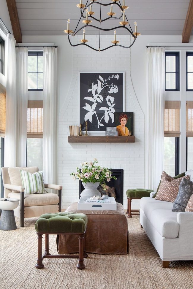
If you're ready to paint your ceiling for the first time, designer Bria Hammel recommends keeping things simple and timeless with neutral tones.
She notes that painting ceilings requires balance-you want enough contrast or color to add interest without making the space feel cramped or too heavy.
In her sunroom project, she chose a warm gray that lifts your gaze upward while keeping the room feeling open and breathable.
Painting your ceiling in a neutral shade like this one works well because it adds a nice touch to the space and proves that sometimes the smallest decisions matter most.
You don't need bold colors or dramatic choices to make your ceiling count.
Rather, neutral palettes let your other furnishings shine and give you flexibility for future changes.
When you stick with quieter tones overhead, the room stays balanced and comfortable all at once.
Blue And White Coffered Ceiling
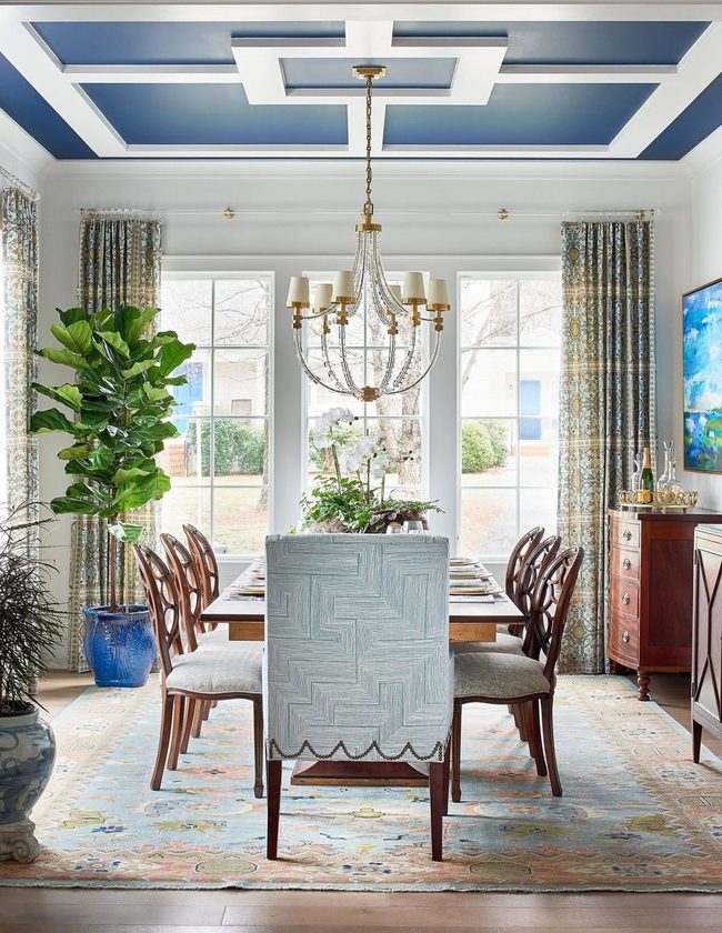
Bold ceiling treatments offer one of the most striking ways to refresh a room without overwhelming your space.
Coffered ceilings work particularly well for this because you can play with multiple colors and patterns across the geometric panels.
In this Warehouse Interiors room, the designers chose a sophisticated blue and white palette that draws attention upward and adds personality to the entire space.
If you love the idea of making your ceiling stand out but worry that one solid bright color might feel too intense, this approach gives you control over how bold you go.
You can keep some panels neutral while letting others pop with color, which means you're not committing fully to a dramatic statement.
The geometric structure of coffered ceilings also helps break up large expanses overhead, so the room feels more visually interesting.
Whether you're working with traditional or modern designs, mixing colors in the ceiling framework lets you express your style without taking risks that might feel too daring for your home.
Blue Ceiling Green Walls
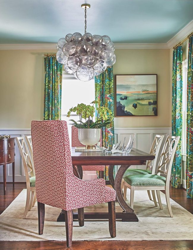
When choosing a ceiling color, sticking with a similar color family is one of the best ways to find that sweet spot between understated and bold.
Light green walls paired with a blue ceiling, like what you see in this Warehouse Interiors space, shows how well this works in practice.
Both cool tones let each color stand out on its own without one overwhelming the rest of the room.
You get a coordinated look that feels balanced and intentional in its own quiet way.
Colors from the same family naturally complement each other and keep your space from feeling chaotic or disconnected.
If you're worried about picking colors that clash, going with tones in the same range takes the guesswork out of the equation.
This approach gives you freedom to play with different shades while maintaining harmony throughout your room.
Sky Blue Ceiling Statement
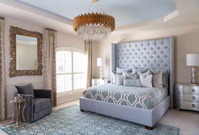
Painting the recessed section of a tray ceiling in a soothing sky blue creates an instantly striking visual that transforms your entire bedroom space, and pairing it with a tufted headboard gives you that cloud-like feeling you're after.
While tray ceilings often hide wires, plumbing, or ventilation systems behind the scenes, there's no reason they have to look boring or plain.
Designer Monica Wilcox showed us how one bold color choice can turn a purely functional feature into something genuinely beautiful.
You don't need to accept the standard white or bland finish that comes standard in most homes.
A soft blue overhead makes your bedroom feel more restful and pulls the whole room together visually.
If you're working with a tray ceiling in your own home, consider what color would make you happy when you wake up and look around.
The right paint choice can shift your entire space from basic to something you'll actually love spending time in.
Black Ceiling White Walls Warmth
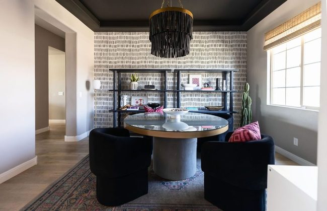
If you love bold design choices, this Arizona-based designer's approach will speak to you-she transformed a white room by painting the ceiling black, creating a high-contrast look that immediately grabs attention.
While black and white can sometimes feel cold or clinical, she added warmth by introducing an accent wall that softened the severity of the two-tone scheme.
A fringed chandelier hung from that dramatic black ceiling and brought additional personality to the space.
Her method shows how simple additions can shift a stark color combination into something with real character.
You can apply this same thinking to your own rooms: start with your bold base, then layer in pieces that prevent it from feeling too minimal.
It's a smart way to balance drama with coziness without overcomplicating things.
The result feels intentional but not overdone, and it proves that high-contrast designs don't have to sacrifice warmth for impact.
Deep Green Ceiling Flooded Sunlight
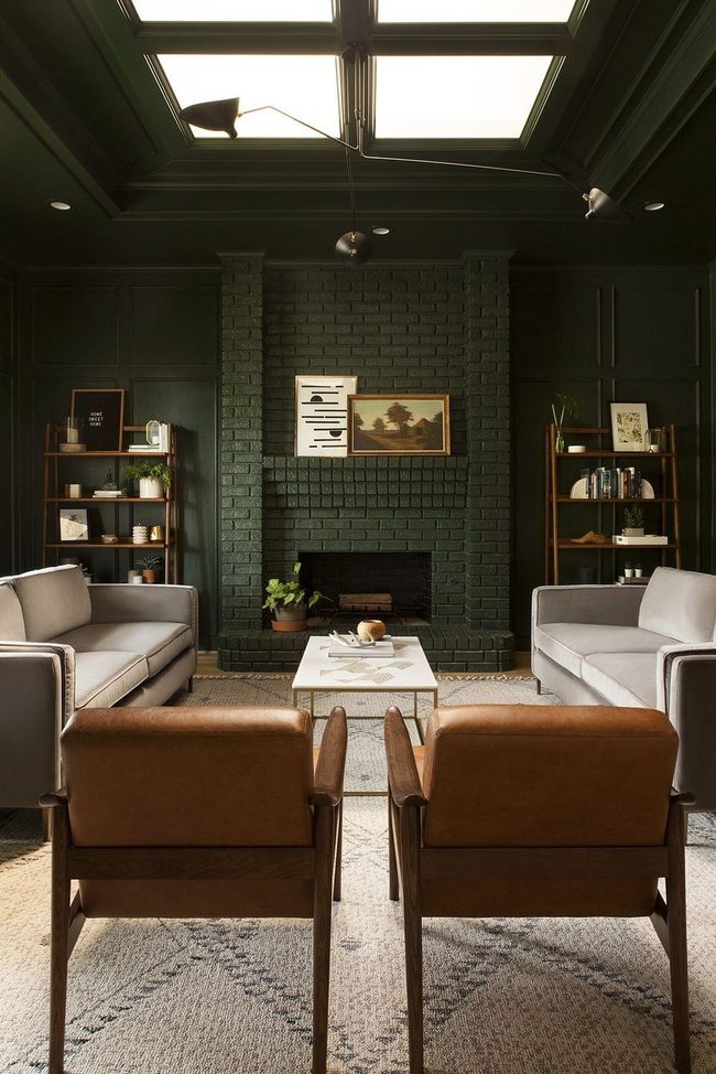
Skylights and windows flood your room with natural light and that's where a bold paint color like deep green really shines-when sunshine pours in, dark walls and ceilings suddenly feel open and spacious instead of cramped.
Designer Sarah Fultz proved this works beautifully by painting both the walls and ceiling of her living room in a rich green tone that could easily feel heavy in a dim space.
What makes the difference is that large skylight overhead, which completely transforms how the color reads throughout the day.
You might worry that covering your ceiling in such a dark shade would shrink the room, but the natural light streaming in actually does the opposite.
Sunlight bouncing off those verdant surfaces creates brightness and movement, preventing the space from feeling closed-in.
Before you paint your own ceiling a deep color, look at how much natural light enters throughout the day.
Windows and skylights are your secret tool for pulling off darker hues without sacrificing that airy, open feeling.
This approach works because you're letting nature do the heavy lifting for you.
Gray Geometric Pattern Unity
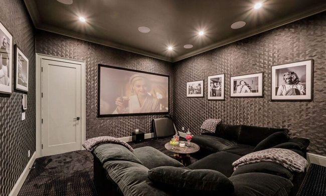
Wallpaper with bold geometric prints can transform your space into something both refined and noticeable, and pairing it with a matching paint color on your ceiling creates a harmonious look that feels intentional without being over the top.
In a home theater design, mixing a light gray ceiling with geometric wallpaper in the same shade adds texture and visual interest to the walls while keeping everything balanced.
This approach works because the consistent color throughout the room prevents it from feeling chaotic or overwhelming, and the pattern itself brings just enough personality to make the space feel polished.
You don't need to go wild with multiple colors or clashing patterns to achieve a room that feels both pulled together and inviting.
Sometimes the best decorating move is choosing one color family and then playing with how you apply it through paint, paper, and texture.
When done right, this method gives you a space that feels refined without looking sterile or boring.
Black Ceiling, Cobalt Spark
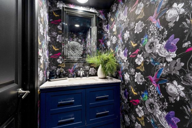
When you walk into a room painted black, it might feel cramped at first, but the designers at Gray Space Interiors show how to pull it off with style.
This East Coast firm pairs a black ceiling with playful wallpaper patterns that keep the space from feeling too heavy.
Bright color bursts, like a cobalt vanity, interrupt all that darkness and inject personality into the room You don't need to shy away from black walls if you add lighter elements to dance around them.
Mixing bold colors with dark surfaces gives the space energy instead of gloom.
Small rooms don't have to feel suffocating when you layer in pops of brightness and pattern.
This combination proves that dark design choices can feel fresh and fun rather than confined.
Golden Walls Catch Every Light
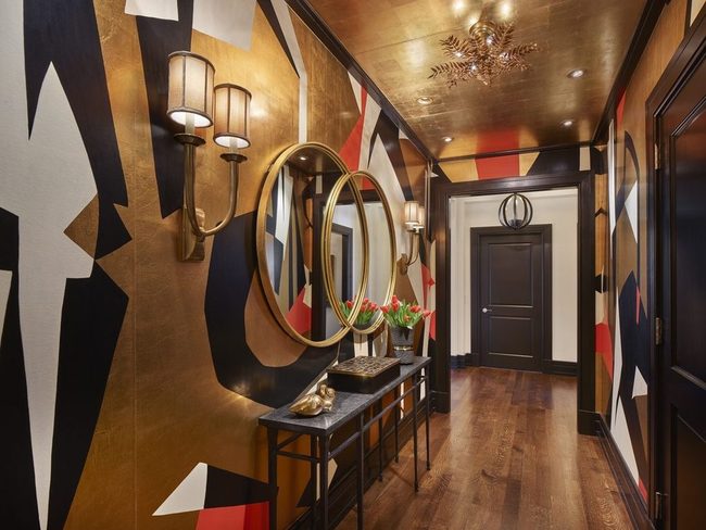
If you want to bring drama into your space, consider what Marguerite Rodgers achieved with her golden high-gloss walls that practically shine under light and demand attention the moment you walk in.
This Philadelphia-based designer paired those reflective surfaces with ornate light fixtures that enhance the glow and add layers of sophistication to the room.
When metallic paint catches the light just right, it transforms the entire space into something that radiates warmth and luxury without feeling overdone.
You don't need much else when your walls do the heavy lifting for you Adding ornamental fixtures gives the space personality and prevents it from feeling too modern or cold.
It's a combination that proves sometimes the most striking decorating choices are also the simplest ones.
Pink Walls Create Ceiling Illusion
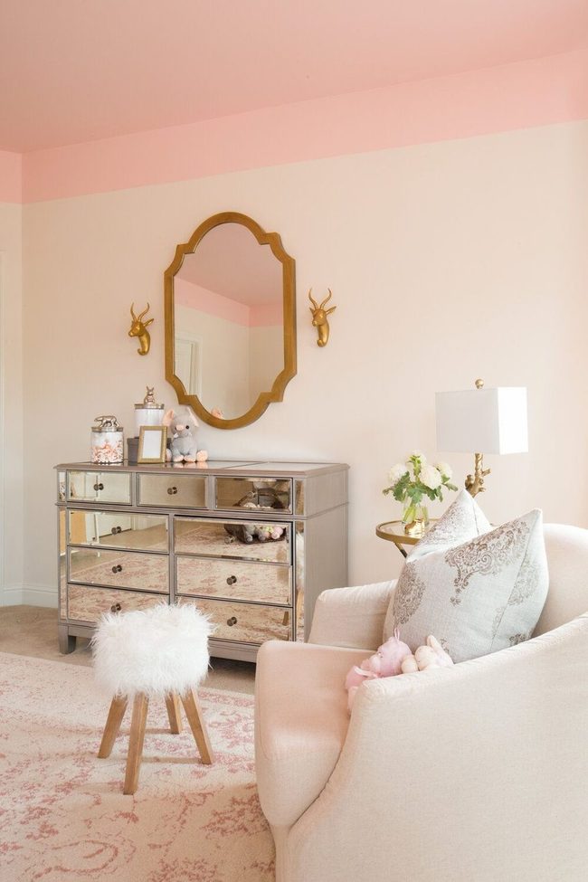
If you're drawn to the look of tray ceilings but a full renovation feels like too much right now, here's a clever trick that works without all that construction.
Paint the upper portions of your four walls to match your ceiling color, and you'll instantly get that recessed ceiling effect that usually requires major work.
It's one of those solutions that feels designer-level but stays totally doable for anyone with a paintbrush and some time on a weekend.
The beauty here is that you get high-impact results without the mess, expense, or hassle of actual ceiling work.
This method proves you can break design rules and achieve premium results by thinking creatively about color placement.
Morgan Huxley
Founder & Creative Director
Expertise
Interior Design & Bold Décor Concepts, Creative Color Applications & Artistic Details, Budget-Friendly Styling, Sustainable Design Practices
Education
Parsons School of Design, New York, NY
New York Institute of Art and Design (NYIAD)
Morgan Huxley is a designer with a passion for bold interiors that feel personal and inviting. As the founder and creative director of [Brand Name], he helps homeowners bring color, texture, and personality into their spaces. With a degree from Parsons and a decorating certificate from NYIAD, he blends artistic expression with practical design solutions.
Morgan believes that great style shouldn’t be out of reach. He shares budget-friendly tips, sustainable ideas, and creative design tricks to make any home feel elevated.
When he’s not designing, you’ll find him exploring NYC’s art galleries, street murals, and food spots for fresh inspiration.