
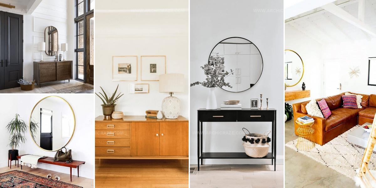
20 Smart Mid Century Modern Entryway Ideas That Work

Mid Century modern entryway ideas bring timeless style and functional beauty right where guests first encounter your home.
Clean lines paired with warm wood tones create an atmosphere that feels both sophisticated and approachable when someone walks through the door.
The philosophy behind this design movement emphasizes simplicity without sacrificing character or visual interest.
Practical storage solutions blend seamlessly with decorative elements that showcase the era's iconic aesthetic principles.
Natural materials and organic shapes work together to establish a space that radiates calm confidence.
Whether working with a compact area or generous square footage, the principles remain adaptable to different layouts and personal preferences.
Revitalizing this often-overlooked zone can set a welcoming mood for everything that happens beyond it.
Geometric Hardware Meets Modern Lines
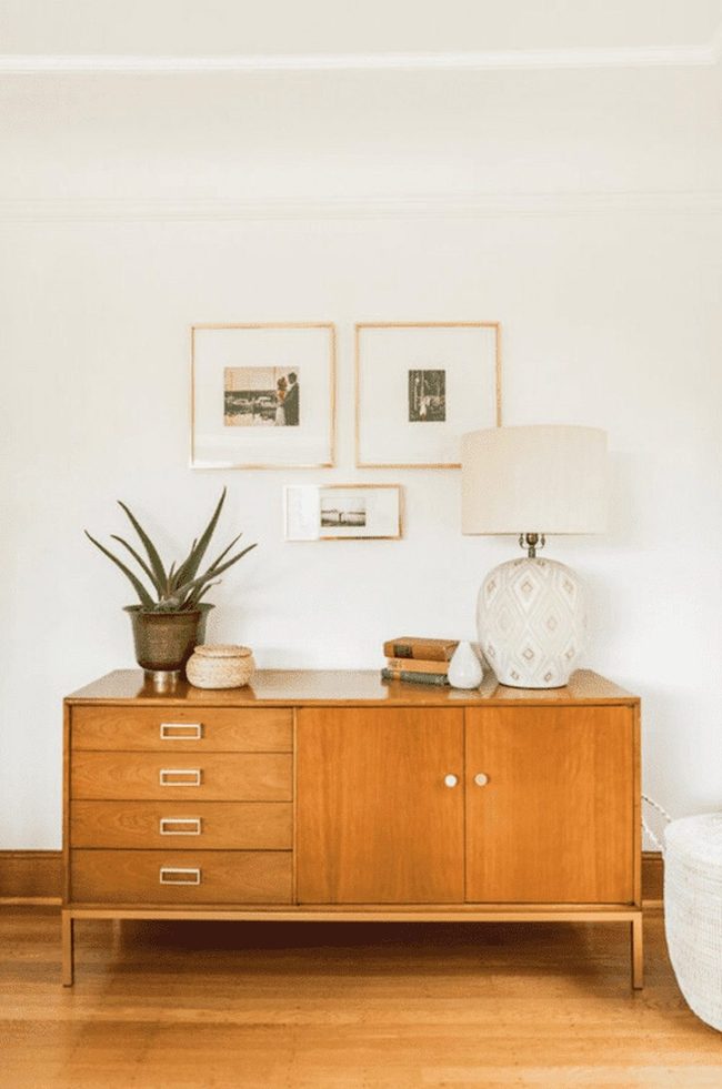
Geometric shapes show up constantly in mid-century modern style, and you have lots of options for bringing them into your entryway.
Square and rectangular frames pair well with rounded accessories, so consider mixing both sharp and curved lines throughout the space.
Swapping out standard drawer pulls for geometric versions like rectangular ones gives hardware a sharp, modern edge.
Combining different shapes across your decor keeps things interesting and fresh.
You can play with angles and curves on walls, furniture, and smaller pieces.
Even simple changes like new pulls or frame choices make a real difference.
This approach lets you build a cohesive look without major renovations.
Small geometric touches add personality while staying true to mid-century style.
Open Floor Minimalism
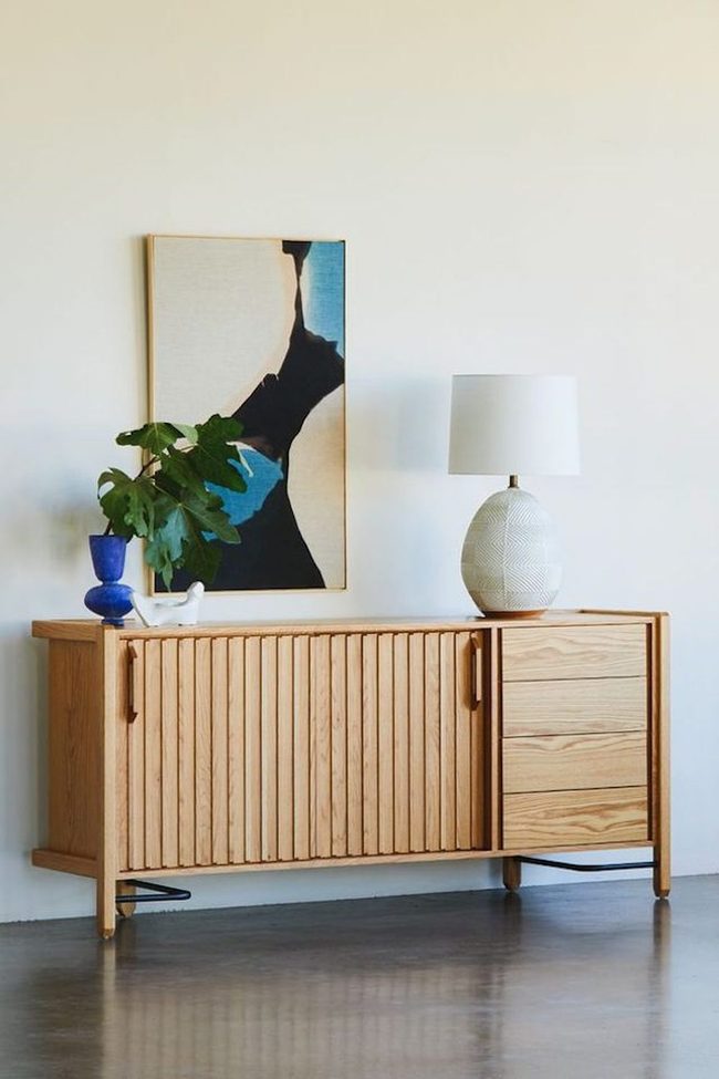
Modern design and minimalist style pair naturally because both favor clean lines and legs-on furniture that opens up your space and lets it breathe.
You can carry this same approach through your whole room by keeping decoration to a bare minimum.
Stick with just a few pieces that matter rather than filling shelves or walls.
Open floors and uncluttered surfaces make rooms feel larger and calmer Wall space stays mostly blank, and you leave room to move around freely.
Keep your color palette simple and your furniture selection focused.
Less stuff honestly means more peace in your everyday living.
Black Leather Entry Bench
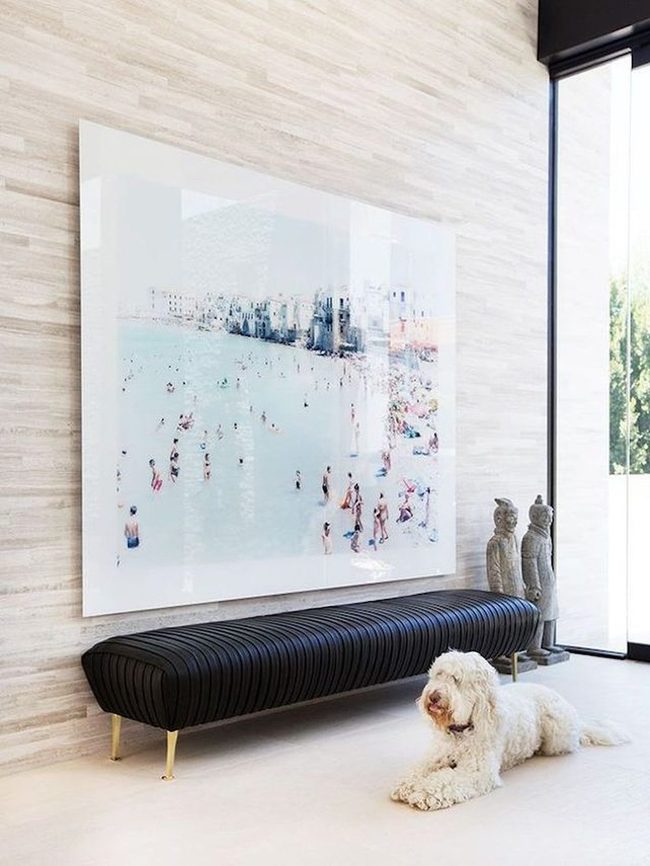
Sleek black leather backless bench represents the clean lines and minimalist approach of midcentury modern style, and placing one in your entryway gives you both beauty and function.
You get a practical spot to slip your shoes on and off as you come and go throughout the day.
Low-profile pieces like this don't clutter your space or demand attention the way taller furniture might.
Such simple furnishings fit well with modern design because they keep things uncluttered and calm Your entry becomes more polished when you choose understated pieces that balance style with everyday usefulness.
It's refreshing to find furniture that looks good and actually solves a real problem in your home.
Plastic Meets Wood Midcentury
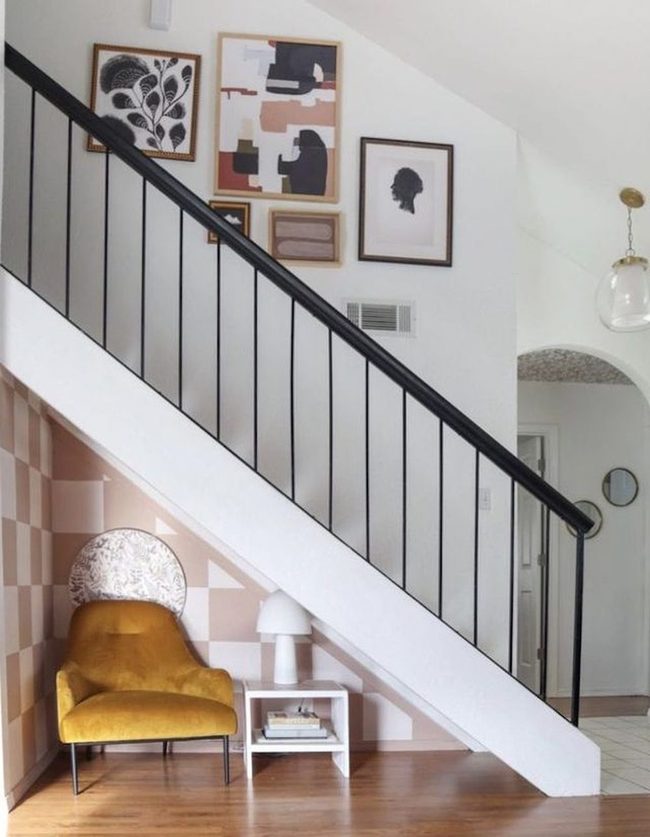
Mixing plastic, formica, and acrylic with wood and natural fibers gives your entryway that authentic midcentury feel, and these contrasting materials work best when you pair them boldly.
Designers of that era loved experimenting with new synthetics alongside traditional organic elements, so don't shy away from combining a sleek plastic chair with a woven jute rug.
Smooth acrylic or polished metal surfaces next to rough stone or warm wood creates visual interest that catches people's attention right away.
You can display a glossy formica cabinet beside a natural wood accent wall and the difference between them makes both stand out more.
Try adding a concrete floor with a organic cotton runner to balance cold and warm tones.
Layering these opposing textures and materials together is what made midcentury design so appealing and modern.
Mix high-gloss finishes with matte surfaces and shiny metals with natural textures, and your entryway will have that authentic retro-modern character that feels both timeless and interesting.
Mint Green Midcentury Door Statement
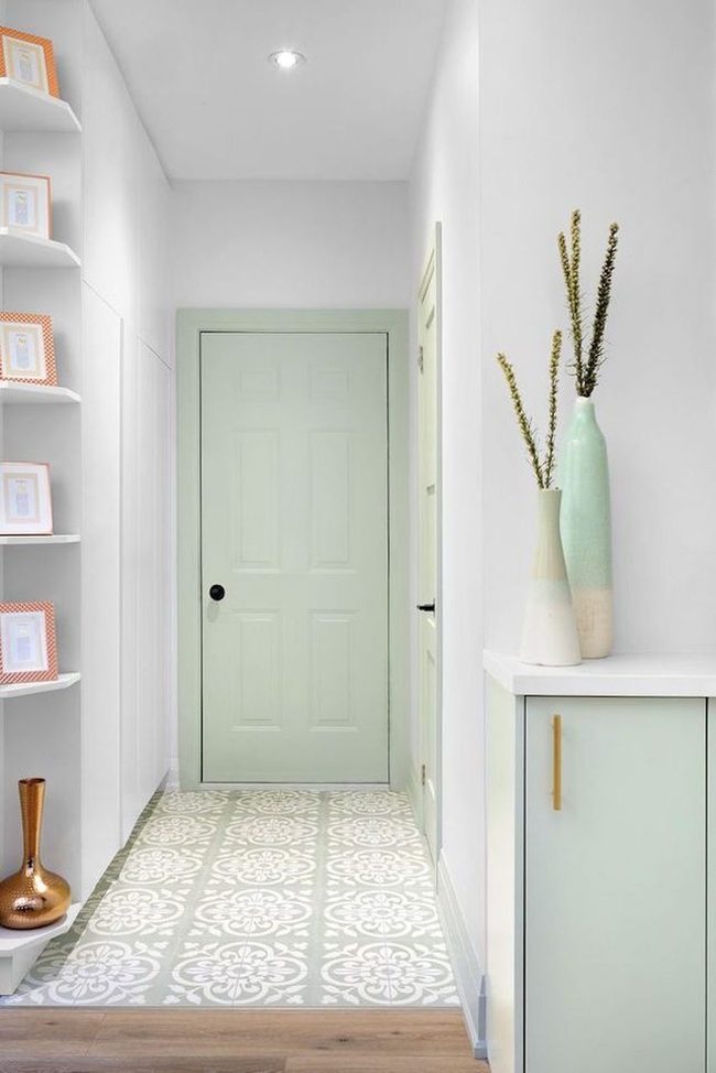
If you stroll through a Palm Springs neighborhood, you'll spot pastel mint green on nearly every corner, and for good reason-it's the quintessential midcentury hue that defined an era.
Consider painting your front door this shade right away because nothing says classic design quite like a fresh mint green entrance that welcomes people the moment they arrive.
You can also bring this color into other areas of your entryway through trim work, shutters, or even a small accent wall inside the door frame.
Pastel shades work beautifully on their own, though pairing mint with crisp white or warm wood tones amplifies that retro charm.
If a full door seems too bold, you might try this color on a side gate, planter boxes, or mailbox instead.
We think even small touches of pastel mint can shift the entire mood of your home's exterior.
The beauty of this approach is that it feels both nostalgic and fresh at the same time.
Your entryway becomes a statement before anyone even steps inside.
Statement Bench Midcentury Entryway
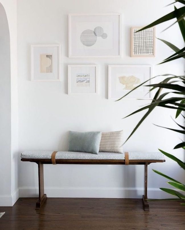
Midcentury modern spaces shine when they feature bold statement pieces rather than cluttered shelves of small trinkets and collections.
If you want your entryway to feel true to this style, keep things pared down and let a few standout items do the work.
One striking bench paired with neutral wall art sets the tone without overwhelming the space Your eye naturally moves toward the important elements when there's nothing competing for attention.
It takes discipline to avoid the temptation to add more, but you'll find the space feels more sophisticated this way.
Less really does mean more when it comes to modern design, and the simplicity is what makes the whole room feel intentional and calm.
Neutral Base, Colorful Accents
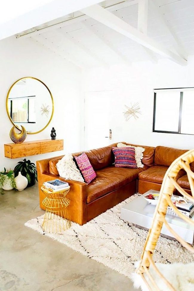
Neutral colors form the backbone of midcentury modern style and remain timeless no matter what season or trend comes around.
Back in the fifties, designers favored bold bright shades, while the sixties brought in warmer earth tones instead.
You can blend these classic approaches together by building your space around neutral walls and furniture, then adding pops of color through easy-to-swap pieces like pillows and rugs.
This method gives you the best of both worlds-a calm, balanced foundation that won't feel dated and room to express yourself through smaller accents.
Symmetrical Pairs, Centered Balance
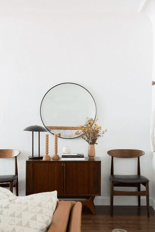
Matching pairs of chairs flanking your foyer console table give the space that balanced, orderly feeling midcentury modern is known for, and this simple trick anchors the entire entrance.
Symmetry matters when you're arranging objects on top of the console too-position your taller pieces toward the edges and keep shorter items clustered in the center.
You don't need to overthink it; this approach keeps things looking polished and intentional without feeling stiff or forced.
Even small touches like mirrored vases or bookends on either side of a lamp base help reinforce that pleasing sense of harmony.
When both sides of a room match up, your eye naturally settles into a calm rhythm.
This principle works because our brains are wired to find balance satisfying and peaceful.
Applying symmetry throughout your space makes everything feel more put-together and connected.
Functional Form Stands Time
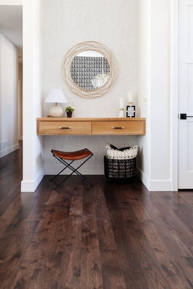
Midcentury modern design strips away anything that doesn't serve a real purpose, and that's exactly why furniture from back then still shows up in homes and thrift stores today.
Pieces were built tough and made to work hard, not just to look nice.
In your own foyer, you might set up a catchall area that does exactly what you need it to do: hold the stuff you dump when you walk through the door at the end of the day.
Over time, this space becomes second nature to you and keeps working without asking for much When something serves you well day after day, it earns a spot in your home and stays there for years.
What made this design movement stick around isn't fancy styling but honest, hardworking design that gets the job done.
Monochrome Midcentury Wall Gallery
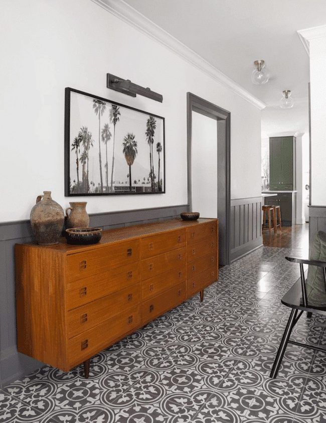
Vintage black and white photographs deliver an instant sense of timeless sophistication to any room, and we recommend seeking out images from classic midcentury locations like Palm Springs to strengthen your retro aesthetic.
Such photos work beautifully alongside your midcentury furniture and accessories.
You can hang them in a grid pattern across a wall or scatter them in clusters for visual interest.
Pairing these images with your existing pieces ensures everything feels connected and balanced.
Consider mixing frame styles or keeping them uniform depending on what feels right for your space.
Black and white imagery also pairs well with nearly any color palette you choose.
It's one of the easiest ways to anchor a room in a specific era while maintaining flexibility with other design choices.
Tapered Legs And Curved Edges
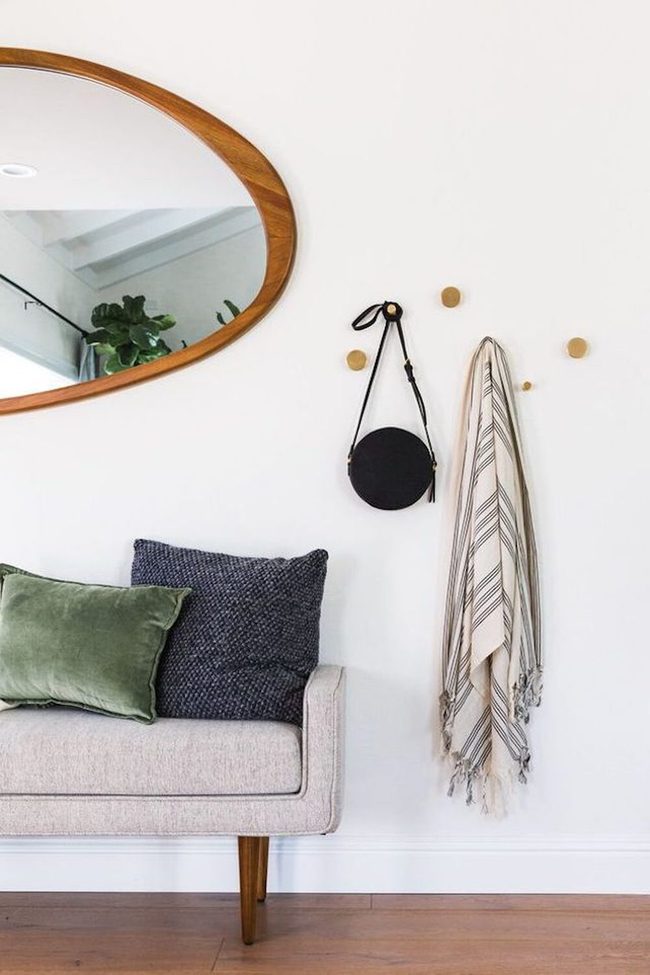
Midcentury furniture has made a big comeback, and you'll find plenty of options no matter your budget.
When shopping for pieces, search for classic silhouettes with tapered legs and organic shapes like curved mirrors or rounded edges.
Stores everywhere now stock these styles, so finding authentic-looking reproductions is easier than ever.
You don't need to spend a fortune to bring this aesthetic into your home.
Simple pieces with clean lines and natural materials work well for this look.
Mixing new finds with what you already own helps build the style gradually.
Start small with accent pieces and work your way up to larger furniture items.
Large Fiddle-Leaf Figs Transform Midcentury Rooms
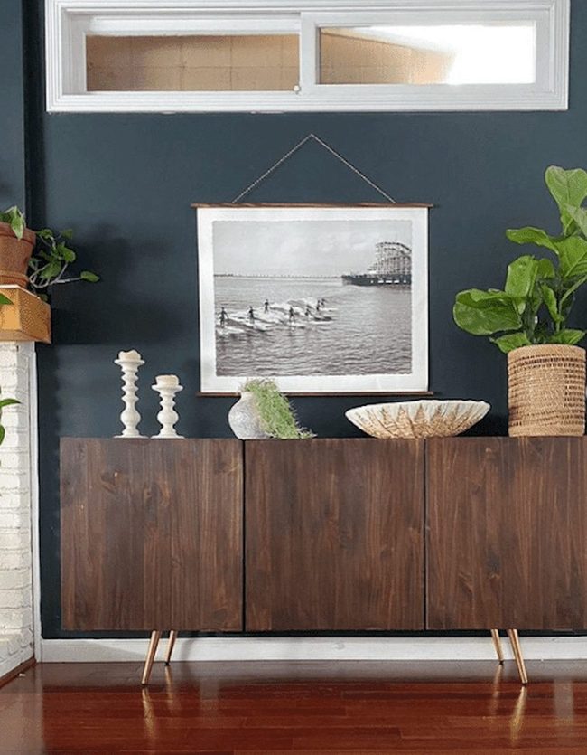
Plants bring life to any room, and they're absolutely crucial when you're designing a midcentury modern space.
Large Fiddle-leaf Figs with their dramatic broad leaves make an immediate visual statement in corners or next to furniture.
Monstera Deliciosa adds that bold tropical energy with its distinctive split leaves and natural appeal.
Snake Plants offer clean, architectural lines that fit perfectly with the mid-century style.
Beyond just looking good, greenery ties your whole room together and keeps the space from feeling sterile or dated.
You can place plants at different heights and in various spots around your home to build depth and interest.
Going green isn't just about following a design trend-it genuinely makes spaces feel fresher and more grounded.
Even if you're new to plants, these three varieties are forgiving and thrive in most indoor conditions.
Clean Lines Minimal Foyer
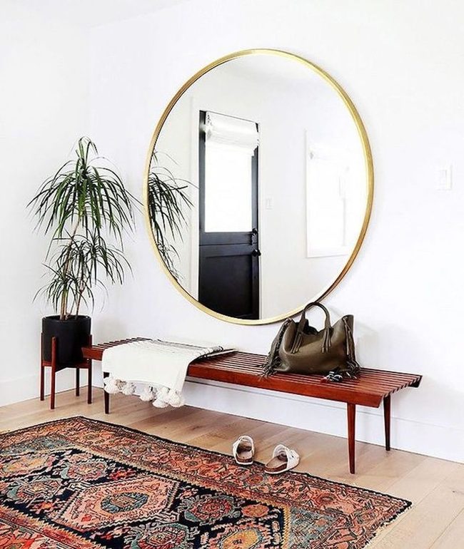
Midcentury modern spaces shine when you stick with furniture that has clean lines and almost no extra decoration, so a simple bench paired with a basic planter can transform your foyer into something perfectly on-theme without overdoing it You don't need much to nail this style because the simplicity itself becomes the strength.
Bare walls and minimal accessories actually make the room feel larger and more open.
It's about choosing items that serve a purpose while maintaining that stripped-down aesthetic that defines this era.
When you walk in, the understated vibe immediately sets the tone for the rest of your home.
Less really does mean more in these spaces, and you'll find that restraint becomes more interesting than abundance.
Tall Mirror Opens Small Entry
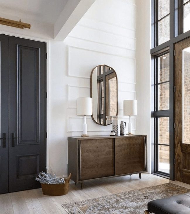
When your entryway feels cramped and low, you can still make it seem taller and more open through smart design choices that guide the eye upward and outward.
Start by selecting tall pieces like an oversized oval mirror, which bounces light around the space and makes walls appear higher than they actually are.
Pair this with elongated lamps on either side to reinforce the vertical pull and add brightness throughout the room.
Hang artwork higher on your walls or add shelving that extends upward to keep the momentum going.
Simple decisions like these shift how people experience your entry space and make them feel less confined.
You don't need major renovations or expensive overhauls-just thoughtful placement of the right pieces can completely change your entryway from feeling boxed in to feeling open and airy.
Geometric Chandelier Brightens Entryway
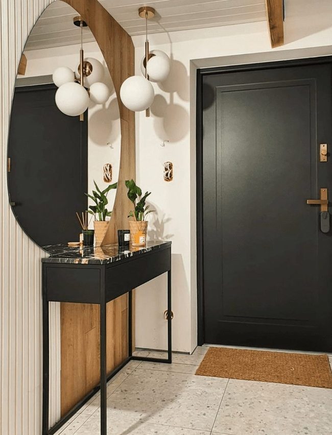
Bright lighting in your entryway makes an immediate difference, and choosing a fixture with geometric shapes and clean lines keeps everything aligned with your midcentury aesthetic.
A Sputnik-inspired chandelier or similar piece with that space-age quality works perfectly in a foyer because it serves double duty-you get the light you need and a statement piece that announces your design choice right as people walk through the door.
We all know how much a dark entry can feel unwelcoming, so this kind of fixture solves that problem while staying true to the midcentury modern vibe you're building.
Simple forms and bold shapes are exactly what midcentury design celebrates, and this style of lighting does both at once.
You'll find these fixtures in various sizes, so measure your space and pick one that feels proportional to your entryway.
Installing one shows you've thought about how the room works, not just how it looks.
Your guests will feel the brightness and recognize the design intention immediately upon arrival.
Deep Wood Midcentury Console Table
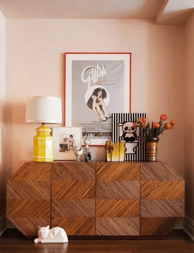
Console table with deep wood tones sets the foundation for midcentury modern style in your entryway, and this piece immediately establishes the aesthetic you're going for.
Large furniture selections that align with this design era help anchor your space and give it authentic character.
Beyond the furniture itself, adding your own personal items on top and around the console makes the area feel genuinely yours rather than like a showroom display.
You might place a vintage lamp, family photos, or decorative objects that reflect your interests and memories.
These touches of personality transform what could be a sterile design reference into a warm, lived-in space.
We recommend selecting items that complement the wood's rich tones without overcrowding the surface.
Your entryway becomes both a welcoming introduction to your home and an honest reflection of who you are.
Black And White Geometric Entry
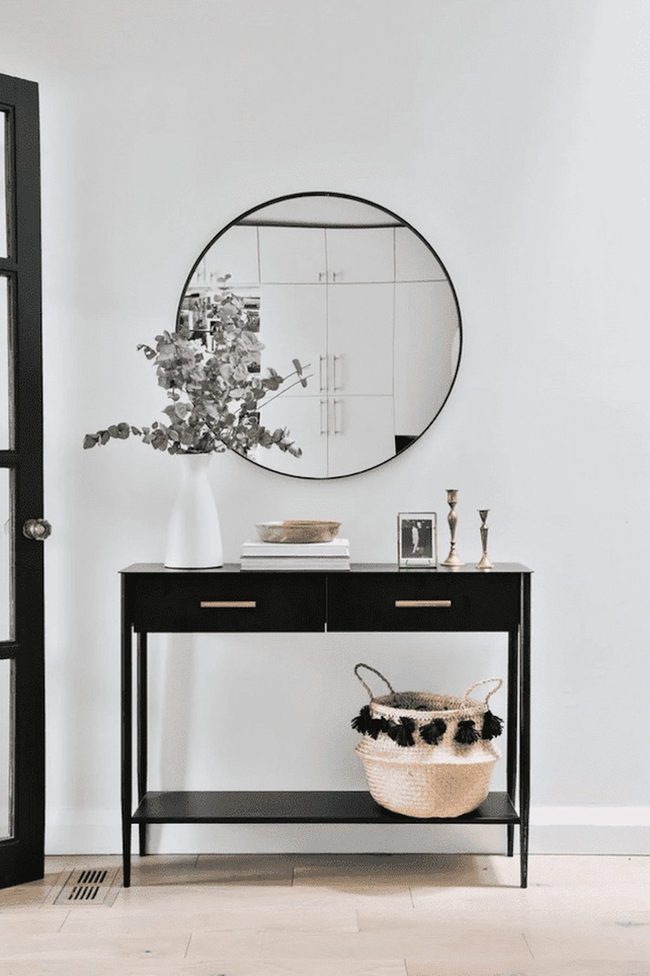
While midcentury modern design often embraces warm tones and soft pastels, black and white graphics form an equally important part of this aesthetic, and they deliver the style's essence in a quieter way.
You'll notice that an entryway done up in monochromatic shades speaks volumes about the era without being loud or demanding.
Pairing crisp black lines with clean white backgrounds gives you that authentic midcentury feel right at your front door.
Geometric patterns in pure black and white hold their ground as a design choice that feels both timeless and specific to the period.
We tend to think of midcentury modern as all about color, but the truth is that this graphic simplicity can be just as powerful.
Consider using black and white in your entry through wall art, furniture pieces, or even floor tiles to nail the look.
You don't need much to make this approach work-just one or two strong elements in these contrasting shades will anchor the whole space.
Atomic Sunburst Ceiling Mural
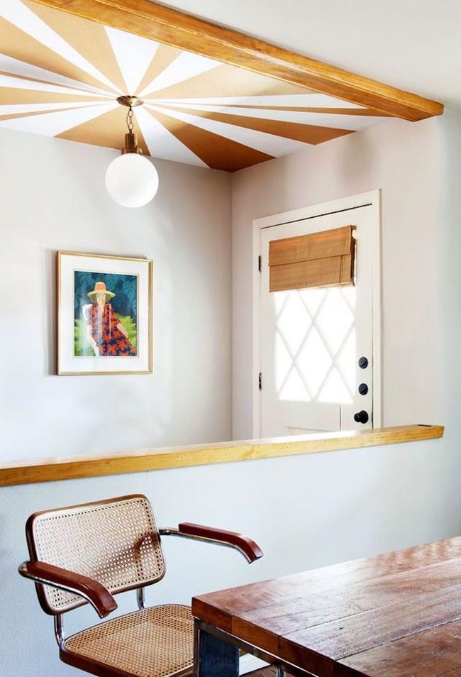
When visitors walk through your front door, their eyes naturally drift upward to discover a stunning atomic sunburst design painted directly across the ceiling-a bold move that screams midcentury modern style.
Most people think of wall decorations and accessories when they want to showcase this retro aesthetic, but going vertical with a ceiling mural takes the concept further and leaves a stronger impression.
Painting this geometric pattern overhead feels fresh and unexpected compared to traditional wall art.
Your guests will immediately sense the personality and design confidence in your space It's a smart way to make your entryway feel memorable without relying on typical decorative pieces.
Adding this kind of overhead element sets the tone for everything else in your home and shows you've thought beyond the usual options.
Open Floor Plan Transformation
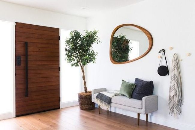
Knocking down a wall between your entryway and living room instantly transforms your home into something that feels more spacious and aligned with midcentury modern design principles.
Open floor plans defined the original midcentury modern movement, and you can bring that same sense of freedom to your own space with one straightforward renovation project.
When you remove a single dividing wall, you're not just adding square footage-you're changing how light flows through your home and how you move between rooms If you're considering this kind of update, removing barriers is one of the most effective ways to capture that authentic midcentury vibe.
Your home will feel more connected and modern once you experience how much better everything functions without unnecessary walls blocking your way.
Even if you only remove one wall, you'll notice an immediate shift in how the space feels to you and anyone who visits.
Midcentury Meets Woven Bohemian
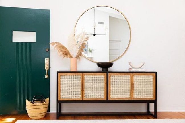
Mixing midcentury modern with bohemian style gives you a fun way to show off what matters to you in your space, and this entryway proves how well two different design approaches can live together.
Clean lines and geometric shapes from the midcentury aesthetic balance beautifully against the free-spirited, natural elements that bohemian style brings to the table.
When you blend these styles, you get rooms that feel both organized and relaxed at the same time.
We enjoy seeing how sharp angles and bold forms sit alongside woven textures and organic materials without fighting for attention.
Playing with style fusion lets you take the parts you actually love from different design directions and skip the rest.
Combining multiple styles isn't about following rules-it's about building a space that reflects how you really live and what genuinely makes you happy.
Trying this approach means your home becomes a real expression of your taste rather than just copying one look from start to finish.
Riley Summers
Co-Founder & Home Styling Expert
Expertise
Smart Space Planning & Layout Optimization, DIY Home Projects & Budget-Friendly Décor, Trend Forecasting & Sustainable Design, Practical Styling Solutions for Every Home
Education
New York School of Interior Design, New York, NY
Riley Summers knows that a well-designed home isn’t just about looks—it’s about function, comfort, and personality. As co-founder of [Brand Name], she specializes in smart space planning, trend-forward décor, and sustainable styling solutions.
With a background in interior architecture from NYSID, Riley helps homeowners maximize their spaces with clever layouts and easy DIY projects. She loves sharing budget-friendly decorating ideas that make high design accessible.
Outside of work, she enjoys strolling through NYC’s neighborhoods, discovering new design trends, and savoring a great cup of coffee.