
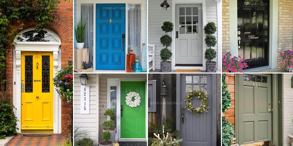
29 Bold Front Door Color Ideas That Welcome Guests

Front door color ideas can completely change how welcoming and stylish a house appears from the street.
Bold hues make powerful statements, while softer shades offer subtle elegance that catches the eye without overwhelming.
A fresh coat of paint ranks among the simplest ways to boost curb appeal and express personality.
The right shade complements existing architecture, landscaping, and neighborhood character beautifully.
Whether drawn to classic neutrals or daring jewel tones, countless options exist for every home style and personal preference.
Seasonal trends come and go, but choosing what resonates with how you see home matters most.
Get excited about finding that perfect shade that makes coming home feel special every single day.
Beige Grasses, Gray Door Entrance
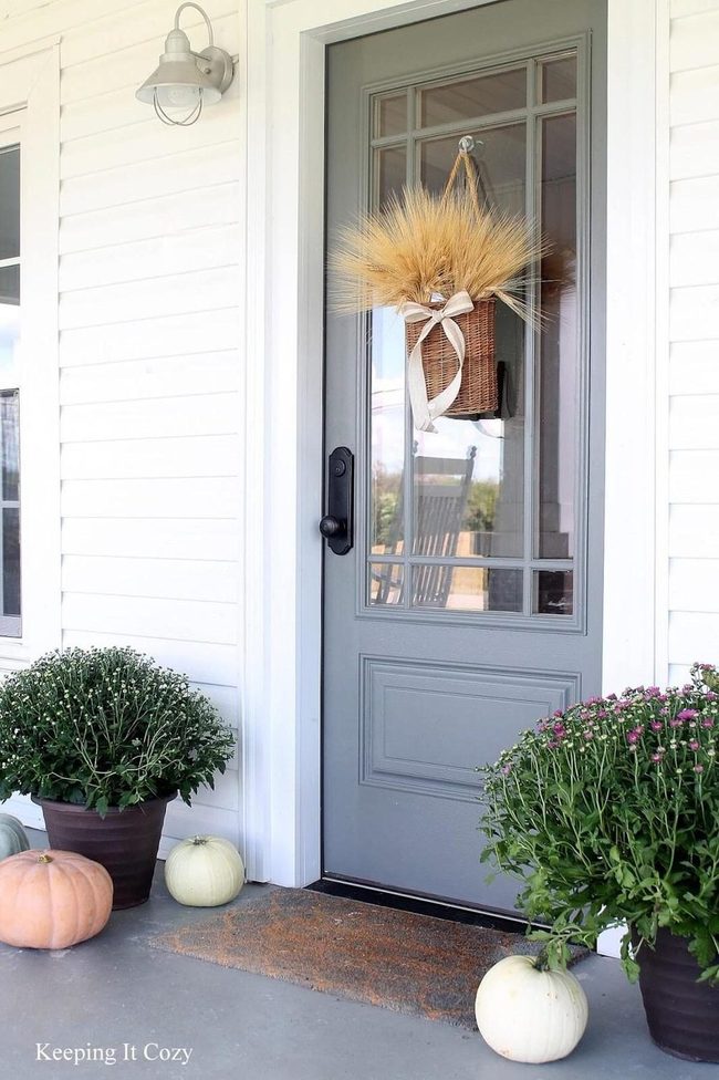
Hanging a basket of dried beige grasses at your entrance makes an immediate statement and sets the seasonal mood right away.
Dove gray for your front door brings sophistication to the space and looks especially refined when your house has white siding.
We love this pairing because it feels classic and restrained, working well for homes that favor understated charm over bold statements.
The neutral tones keep things calm and welcoming without demanding too much attention.
Older homes particularly shine with this combination since the muted palette respects their traditional character.
You can shift into fall without making dramatic changes, letting the season settle in gently through these quieter choices.
Magenta Door Brass Knocker Statement
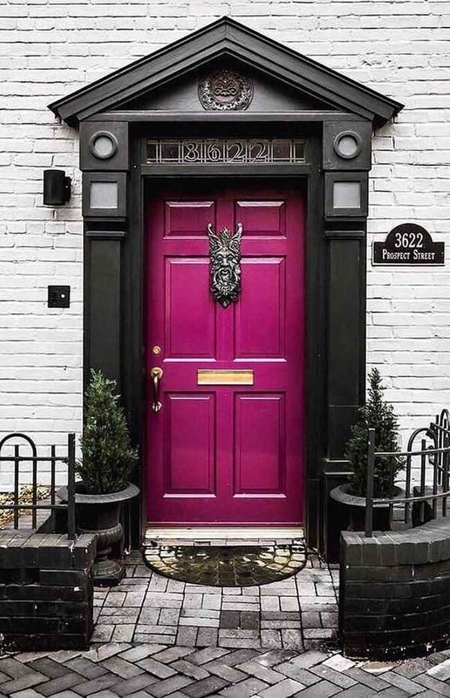
Magenta front door commands immediate attention as it sits boldly against charcoal gray fixtures and brick half walls, and the shiny brass hardware gleams in the light to enhance the entrance even more.
That sculptured knocker on the door brings real character to the space.
When you choose such a striking color for your front door, it becomes the star of your exterior and sets the tone for what visitors will experience inside.
The combination of warm brass tones with the cool gray and brick creates nice contrast that makes the whole entryway feel polished.
We love how this approach balances boldness with sophistication, so the drama doesn't feel overdone.
If you're thinking about refreshing your own front entrance, this setup shows how a single powerful color choice can completely change the way your home looks from the street.
Pink Petunias Against Black Door
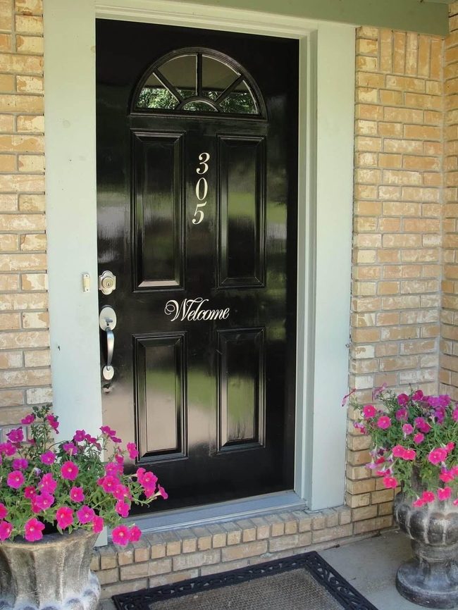
Vivid pink petunias bursting from concrete planters at your entrance make an immediate statement, and this bold color choice grabs attention before anything else.
The shiny black paint on your door creates a stunning contrast against the pale neutral bricks of your home and brings real elegance to the space.
Brushed silver hardware adds a polished, sophisticated finish that i can sense when you approach the door.
House numbers and a welcome sign painted artistically on the door serve both function and style.
Simple touches like these work together to show that someone cares about how their home looks.
We all know that the first impression matters, and these elements combine to make your entrance feel put-together and warm.
Purple Statement Entry Door
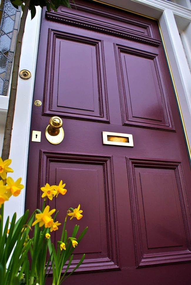
Bold purple on your front door stops people in their tracks and gives your home an immediate sense of style that you won't find on every corner.
Rich, deep shades of purple draw the eye right away and serve as a powerful accent for the whole exterior.
When you lean toward the warmer undertones with red mixed in, the color feels more welcoming and less cold.
Picking a door with intricate architectural details makes your home stand out as something special and shows you care about the design.
Adding seasonal flowers in bright contrasting colors beside your entry brings life to the space and ties everything your door does for the outside of your home into one cohesive look that feels complete.
Red Bow Front Door Statement
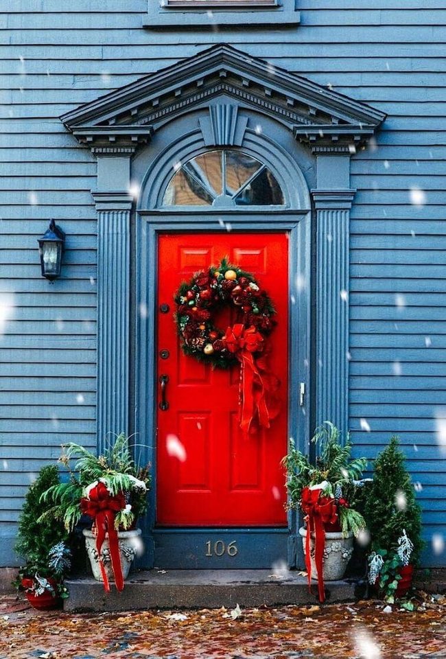
Oversized wreath with a bold red bow commands attention on your front door and brings immediate holiday spirit to the entrance.
The red pops against the muted blue of the house, making the door impossible to miss and adding personality to your home's exterior.
Beyond just the season, red works beautifully with classic architectural elements and gives any entryway a dignified, timeless quality.
This color choice serves double duty since it looks festive during celebrations and remains sophisticated throughout the year.
You'll find that red is one of those rare choices that feels both seasonal and permanent, so switching out decorations won't leave your door looking bare.
The contrast between the deep red and cooler house tones creates visual interest that elevates the whole front of your home.
Turquoise Porch Furniture Statement
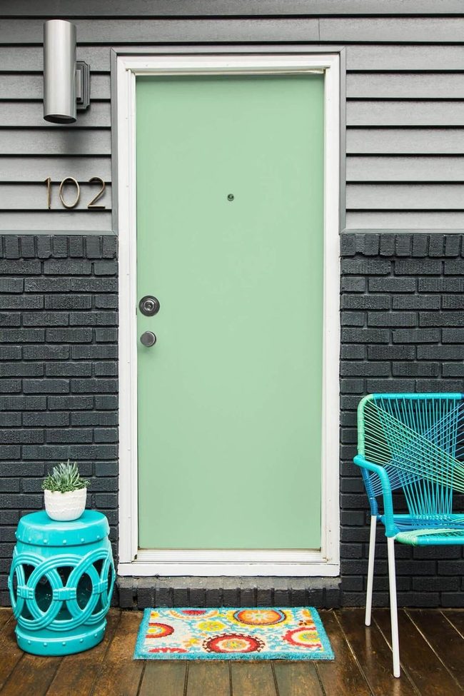
Turquoise furniture pieces like a standing plant holder and seating options pop against the gray siding and brick exterior, drawing immediate attention to your porch area.
Soft mint green accents along the home's facade balance these bolder hues and create a pleasant color scheme.
A cheerful welcome mat at the door ties into this palette while reflecting your personal style and taste.
The homeowner selected outdoor furnishings that work with both the mat and the overall aesthetic of the space.
Gray and brick serve as a neutral base that lets the cooler accent colors shine without overwhelming the senses.
Accessories in turquoise and mint green keep the front entrance feeling fresh and inviting to visitors.
Olive Green Entry With Brass Details
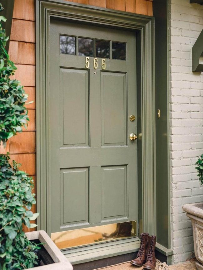
Olive green at the entrance makes an immediate statement next to surrounding plants and landscaping.
This calming neutral tone harmonizes with almost any exterior paint color you might choose.
The home showcases an appealing combination of textured shingles mixed with gray painted bricks.
Brass accents on the door numbers, handles, and kick plate bring polish and sophistication to the overall look.
The calming part is how these metallic touches catch the light and draw attention to the entry in a refined way.
The mix of materials and finishes keeps the facade interesting without feeling busy.
You can easily replicate this approach on your own home by selecting one standout color and layering in complementary hardware.
The result feels both welcoming and well-designed.
Bright Yellow Door, Neutral Elegance
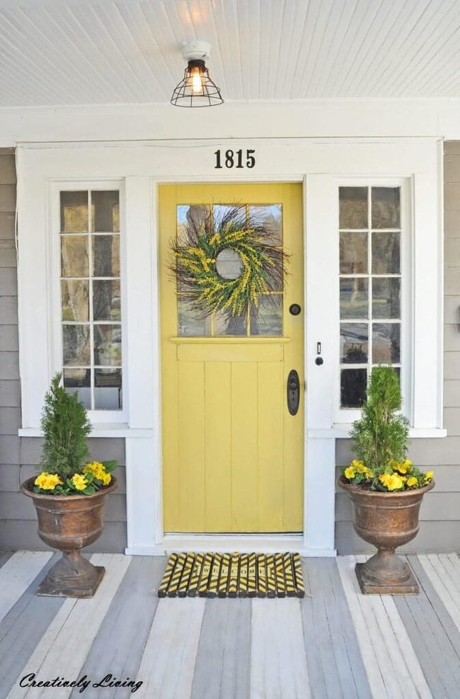
Bright yellow door demands attention and immediately lifts the whole front of your home, especially when the rest of the exterior sits in neutral gray tones.
We recommend matching flowers, a doormat, and a wreath to frame this cheerful entrance and make it even more striking.
Small touches like these help guests feel genuinely welcomed before they even knock.
The sunny hue tells everyone who passes by that you have a fun and lively approach to decorating.
Beyond just looking good, this kind of coordinated entry sets a warm tone for your entire home.
You don't need expensive elements to pull this off, just thoughtful choices that play well together.
Simple coordination like this shows care without feeling overdone, and it genuinely does make people smile when they arrive at your door.
Blonde Wood Stone Entry
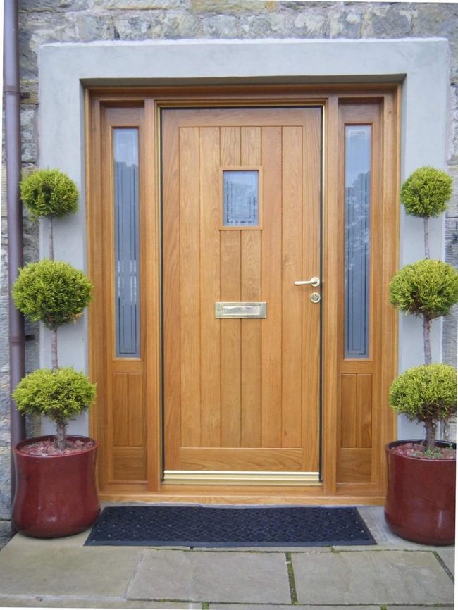
Blonde wood on your front door makes an immediate impression against stone walls, and the natural grain shows beautifully in daylight.
Light gold hardware catches the light just right and pulls the whole look together without being showy.
Frosted glass windows let light filter through while keeping your privacy intact, which is both functional and nice to look at.
The mix of warm wood tones and cool stone creates a welcoming entrance that feels grounded and genuine.
You get that rustic quality without it looking overdone or trying too hard.
It's the kind of entrance that makes people feel comfortable stepping up to your door.
Olive Green Door, Pale Gray Walls
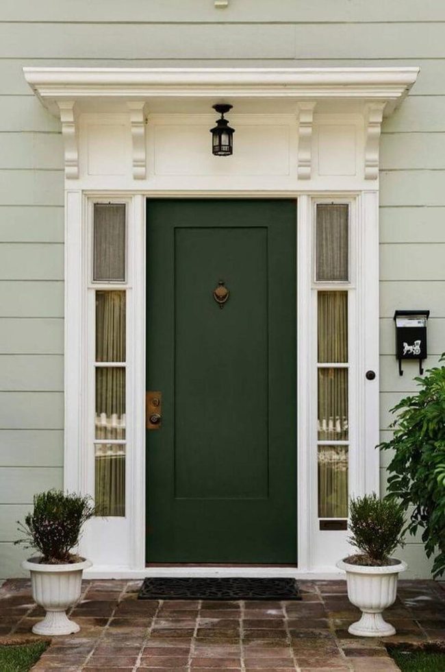
The entrance gains drama from muted olive green on the door set against pale gray exterior walls, and this color pairing immediately draws attention as you approach.
Black light fixtures and a matching mailbox keep the look clean and straightforward without fuss.
Antiqued brass hardware on the door brings a sense of history and refinement to the entryway.
Neutral curtains filtering through the sidelight windows maintain privacy while staying in harmony with the overall scheme.
Elaborate molding running around the entrance adds depth and architectural character that prevents the space from feeling flat or ordinary.
Red Door Black Hardware Statement
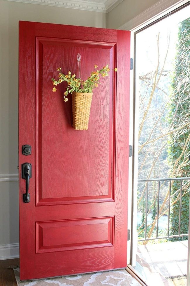
Red door with black brushed metal hardware makes a bold statement at your entrance and commands immediate attention with its classic appeal.
The warmth and energy of that red shade breathes life into your doorway and sets an inviting tone before anyone even steps inside.
Pairing it with a white or gray home exterior lets the door shine as the star of the show, though other house colors work well too depending on your style.
To enhance this striking entrance, consider hanging a basket of spring flowers beside the door, which softens the bold color with natural beauty and adds seasonal freshness to the space.
Orange Door Western Welcome
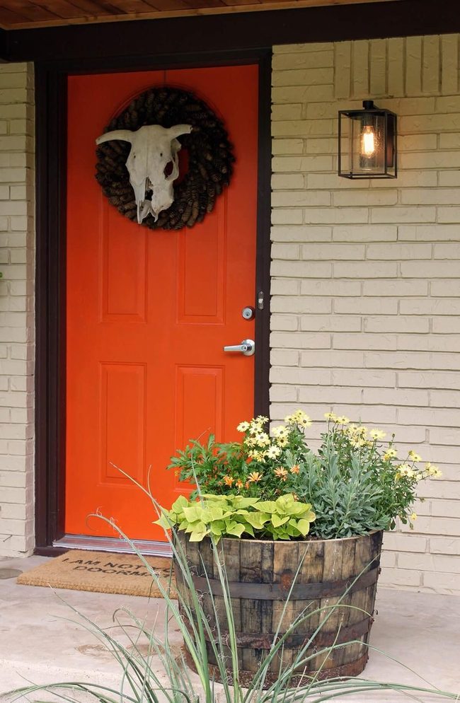
Your home's bold orange front door stands out immediately and sets a warm, welcoming tone for the whole house.
Planters with orange flowers near the entrance pick up on that same color and tie the space together beautifully.
To add personality and humor, the owners hung a cattle skull wreath above the door and placed a funny doormat at the entry, showing off their fun-loving style and sense of humor.
Sailor Blue Door, Cream Number
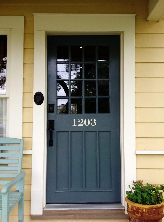
Sunlight floods through the large 16-panel window set into this sailor blue front door, and you get a clear view of anyone approaching your home.
Black metal hardware lines the door and adds a polished touch to the entrance.
A cream house number in an eye-catching font sits prominently and draws immediate attention as soon as someone arrives.
Since the number matches your trim paint, the whole entrance has a unified and put-together look that feels intentional.
Purple Door Gold Entrance
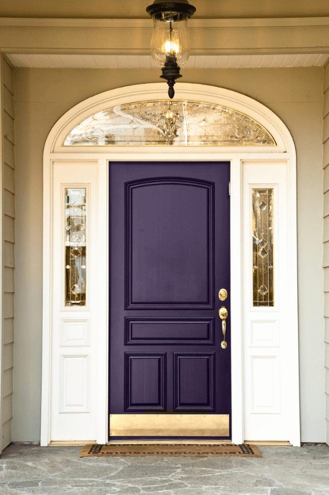
Purple front door makes an immediate statement against your beige house and really grabs attention before anything else about your home comes into view.
Gold accents and stained glass panels around the door lift the whole entrance into something more refined and special.
When you pair this bold purple with the neutral tones of your home's exterior, the contrast brings real energy to that first impression visitors get, and it shows how much impact one strong color choice can have on your curb appeal.
Pink Door Pale Blue Bricks
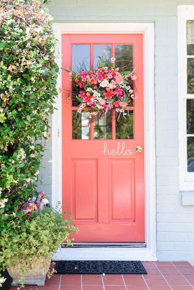
Pink front door makes a bold statement that immediately grabs attention and brings character to your home's entrance.
This cheerful choice works wonderfully alongside flowering plants and greenery, which enhance the playful mood you're creating.
Pale blue brick walls become much more interesting when paired with that pop of pink, and the contrast helps both colors shine.
You can easily customize the space with a natural, overgrown-style wreath hanging above the door, which adds texture and layers to the overall design.
The combination of these elements gives you endless ways to express your personal style and make visitors feel welcomed the moment they arrive.
Magnolia Blooms On Black Door
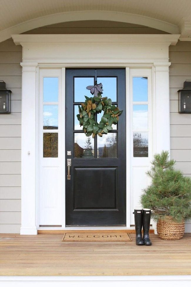
Magnolia leaf wreath hung on your black front door makes a striking first impression with its natural greenery and cream-colored blooms standing out boldly against the dark surface.
Black doors framed by white trim deliver a sharp, sophisticated appearance that instantly elevates your home's curb appeal.
We love how this classic pairing gives you complete flexibility when it comes to adding other decorative elements, since the neutral foundation works well with nearly any color scheme you choose to introduce.
Brushed Bronze Hardware, Apple Green Wreath
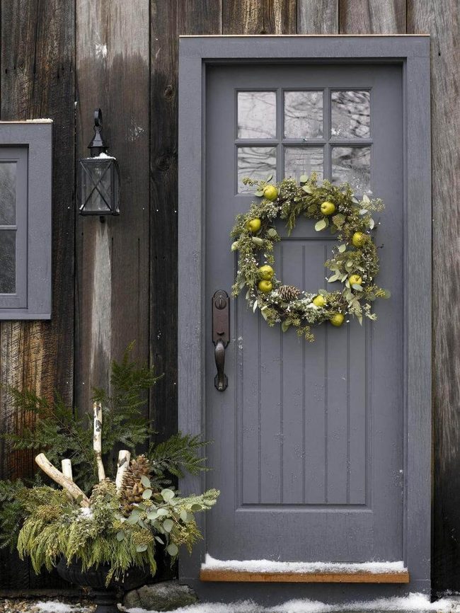
Brown brushed metal hardware on the door stands out as one of the first things you notice when arriving at the home, and its warm metallic tone grounds the entryway beautifully.
Rather than going with traditional red and white decorations, the homeowner chose apple green mixed with muted foliage tones for a winter look that feels fresh and unexpected.
This choice moves away from what most people do during the season and brings something new to the facade.
Neutral gray paint on the house's exterior works well with the unpainted wood paneling, and together they create a calm backdrop that lets the door hardware and seasonal colors shine.
The combination of these natural wood tones and soft grays gives the whole space a balanced feeling.
We can see how stepping away from conventional holiday colors and sticking with nature-inspired shades makes the home feel both modern and timeless.
Turquoise Door With Bronze Hardware
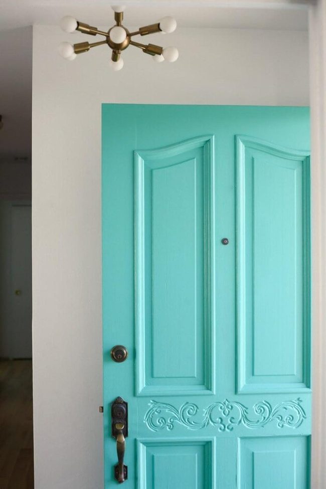
Light turquoise door brings seaside charm right to your home's entrance, and the soft ocean-inspired hue makes an immediate statement.
Brown brushed metal hardware keeps things functional while adding warmth to the design.
The carved panels on the surface give it a classic, timeless feel that connects to traditional design styles.
You get both beauty and purpose in one piece since the hardware serves its job while looking good doing it.
The color works well if you want something beyond basic white or black, yet it stays welcoming and approachable.
These design choices together make your entryway feel like a curated space rather than an afterthought.
The practical part is how simple doors like this one prove you don't need much to change how people see your home's character.
White Door With Brass Hardware
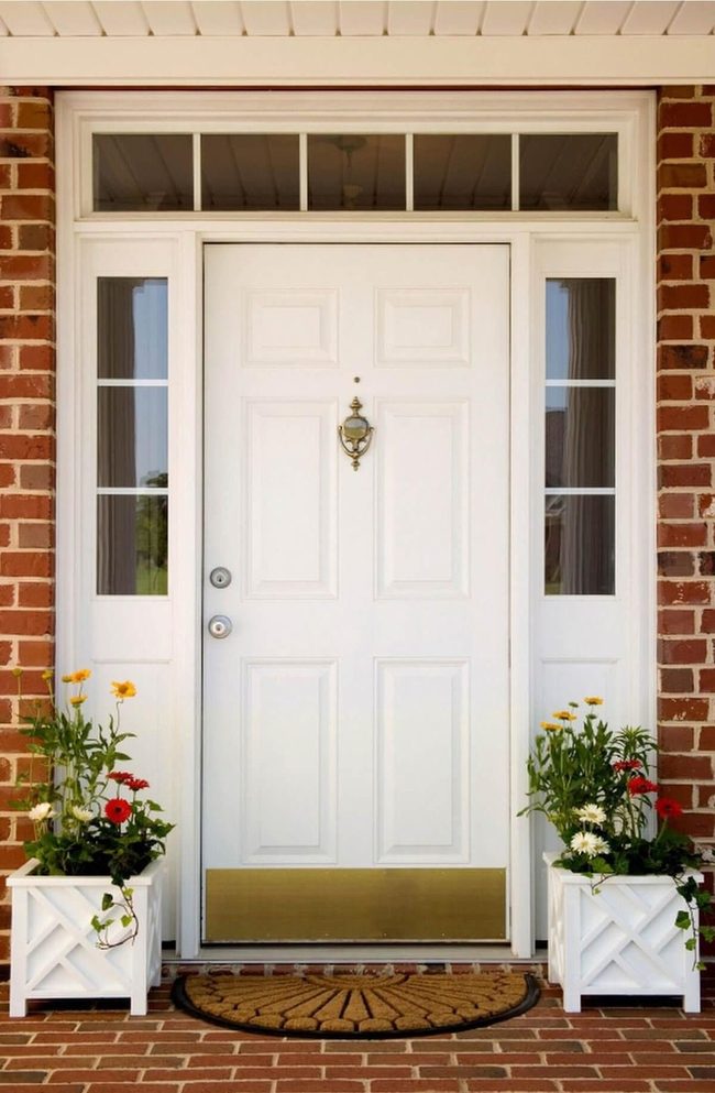
Classic white door stands as one of the most striking elements you can add to your home's entrance, and it does so with a timeless quality that never goes out of style.
The design includes beautiful windows positioned on both sides and across the top, which allows natural light to flow through and makes the entryway feel open and welcoming.
Brass hardware like a traditional knocker and kick plate add authentic character and shine against the white surface.
While bold colors might seem appealing right now, a white door keeps your home looking fresh and polished year after year without the worry of trends fading.
You get a clean, crisp look that works with almost any home style, from modern to traditional.
The brightness of white paint itself lifts the whole entrance and makes everything around it feel more refined.
I can tell how this simple choice gives you flexibility to change other elements around it without the door ever feeling out of place.
Sculptured Green Sentries, Soft Gray Entrance
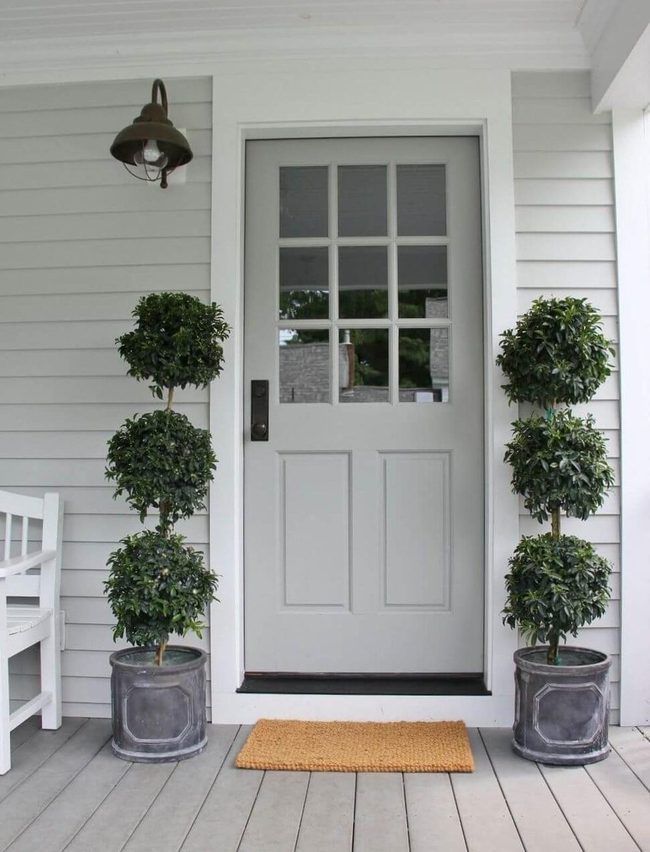
Topiaries positioned on both sides of your doorway make a bold statement that stops people in their tracks the moment they arrive at your home.
Brushed metal hardware on the door brings in a timeless quality that feels polished and refined.
The pale grayish white finish of the door blends seamlessly with your house's exterior and works as a neutral canvas where you can swap out seasonal decorations whenever you want without any clashing or color conflicts.
Turquoise Door With Autumn Wreath
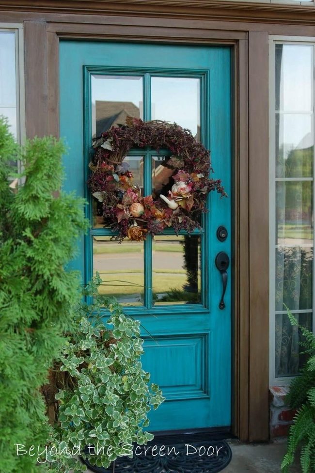
Bold turquoise door makes an immediate statement at your entryway, and the color stays balanced because it's not too intense or dominating.
When you pair this striking hue with a fall wreath in warm tones, the contrast between the cool blue and rich autumn colors becomes really beautiful.
Around the door frame, lush green plants and vines add another layer of natural interest to the space.
The greenery softens the boldness of the door while keeping everything connected and appealing.
You can position planters on either side of the entrance or let climbing vines frame the doorway.
This combination of a jewel-tone door, seasonal florals, and living plants works well together because each element has its own role.
Visitors notice the door first, then their attention moves to the wreath and surrounding greenery.
The overall effect feels fresh and welcoming without seeming overdone or trying too hard.
Oversized Glass And French Blue Entry
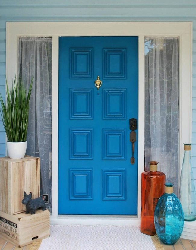
Oversized glass vases positioned near your entrance create an immediate visual statement that pairs beautifully with a French blue front door, and the contrast between clear glass and that rich blue hue draws the eye right away.
The door itself commands attention with its brown frame and brushed metal and brass hardware that catch the light and add warmth to the entryway.
Wide sidelight windows dressed in sheer curtains frame the door nicely and let you peek inside while maintaining privacy, and these windows also suggest how many different ways you could style this space depending on your mood or season.
Red Berry Basket, Natural Wood Door
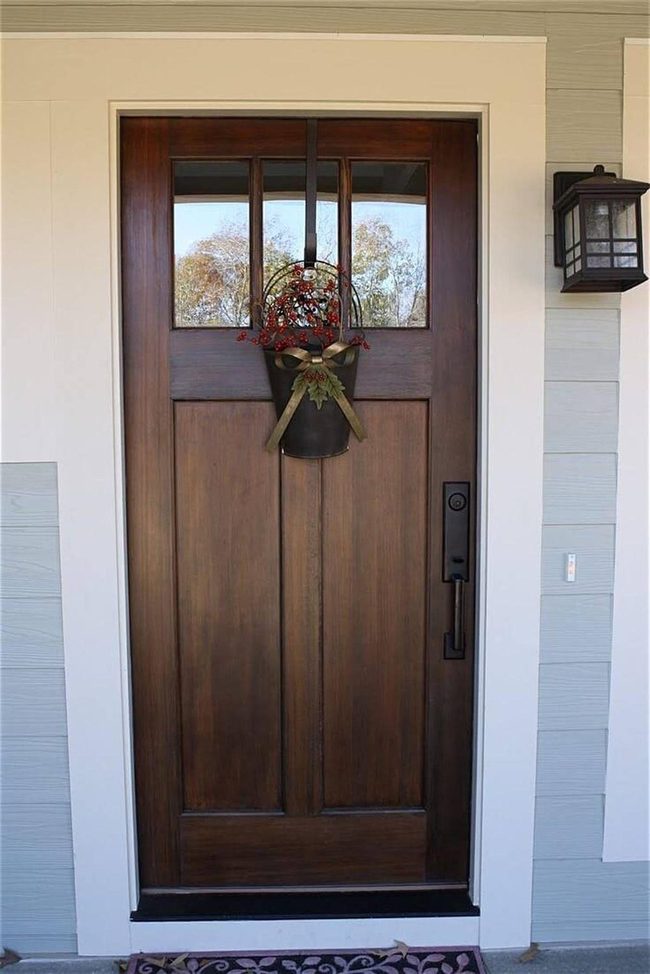
Christmas basket bursting with red berries and greenery hanging from your front door immediately stops people in their tracks as they arrive.
The basket sits perfectly against a classic wooden door that shows off natural grain and warm tones, and this simple backdrop lets the festive arrangement shine without competing for attention.
You can read the door itself has real character with its Mission-style lantern mounted nearby and brushed metal hardware that adds a touch of sophistication to the entrance.
We often skip over what a good hardwood door can do for your home's curb appeal, but the natural warmth and rich color of wood make everything else look better.
When you're thinking about your front door, don't dismiss the hardwood options in favor of painted finishes and modern styles.
The combination of the berry-filled basket and the wood tones works because they're both natural elements that belong together.
Pale Blue Cottage With Blush Accents
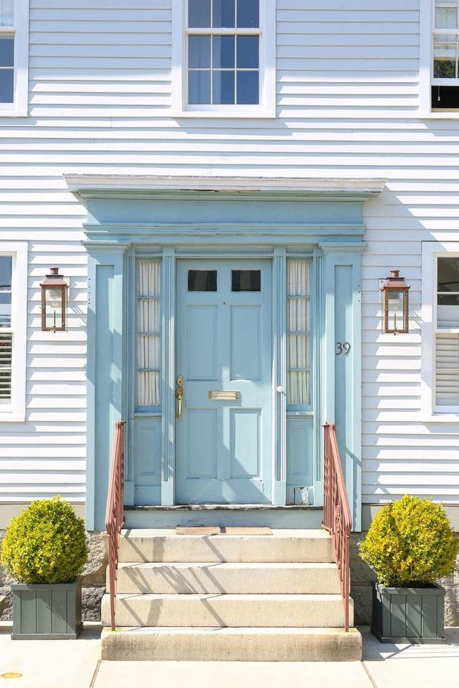
When you walk up to this older home, the sunny pale blue exterior immediately catches your attention with its seaside charm that feels both restful and cheerful.
The white trim along the exterior balances this color nicely and keeps the overall look fresh and airy.
Matching the house itself, the door frame carries the same calming blue shade, which makes the entrance feel like a natural extension of the design.
On the steps leading up, iron railings painted in a delicate blush pink add warmth and personality to the space.
This combination of pale blue, white, and soft pink works well together because each color supports the others without competing for attention.
You can notice how the blushed pink brings a gentle pop of color while staying harmonious with the cooler tones surrounding it.
The mix of these three shades tells a story that feels both timeless and welcoming, making the home feel like a peaceful retreat by the coast.
Galvanized Metal Pail Hydrangeas
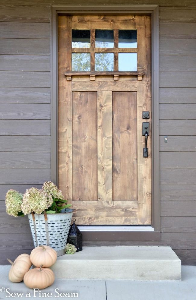
Galvanized pail bursting with hydrangea blooms greets visitors right at your entrance and commands immediate attention with its striking beauty.
Moving inward, the door itself showcases warm neutral wood tones that sit nicely alongside the varied decorative pieces scattered across your porch space.
One detail that makes this special is its burled wood finish paired with six distinct windows that let light flow through and a built-in shelf for displaying your favorite items.
The black brushed metal hardware adds a strong contrast against the textured wood surface, so the overall effect feels bold and confident for any home's style.
We think the combination of these elements works because they balance each other out naturally without feeling overdone.
Purple Door Blue Bench Green Enclosure
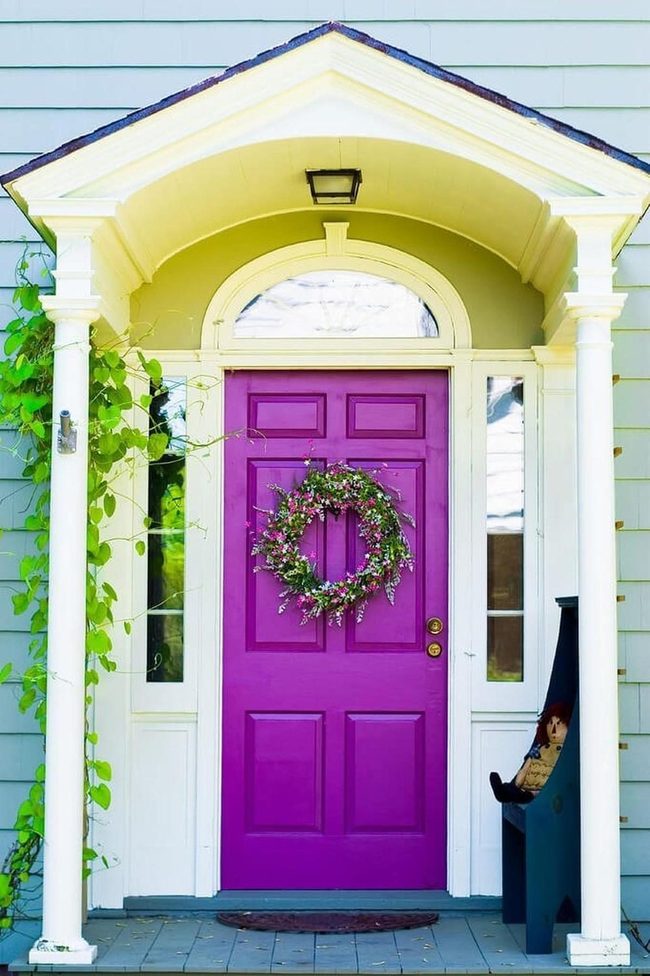
Your front entrance area pops with personality thanks to a mix of bold colors and varied styles that work well together.
A small bench painted blue sits near the doorway and echoes the blue tones you'll find on the porch, creating a sense of connection throughout the space.
The pea green enclosure adds an interesting contrast that makes the vibrant purple door grab all the attention and stand out from everything around it.
Sunshine Yellow Brick Statement
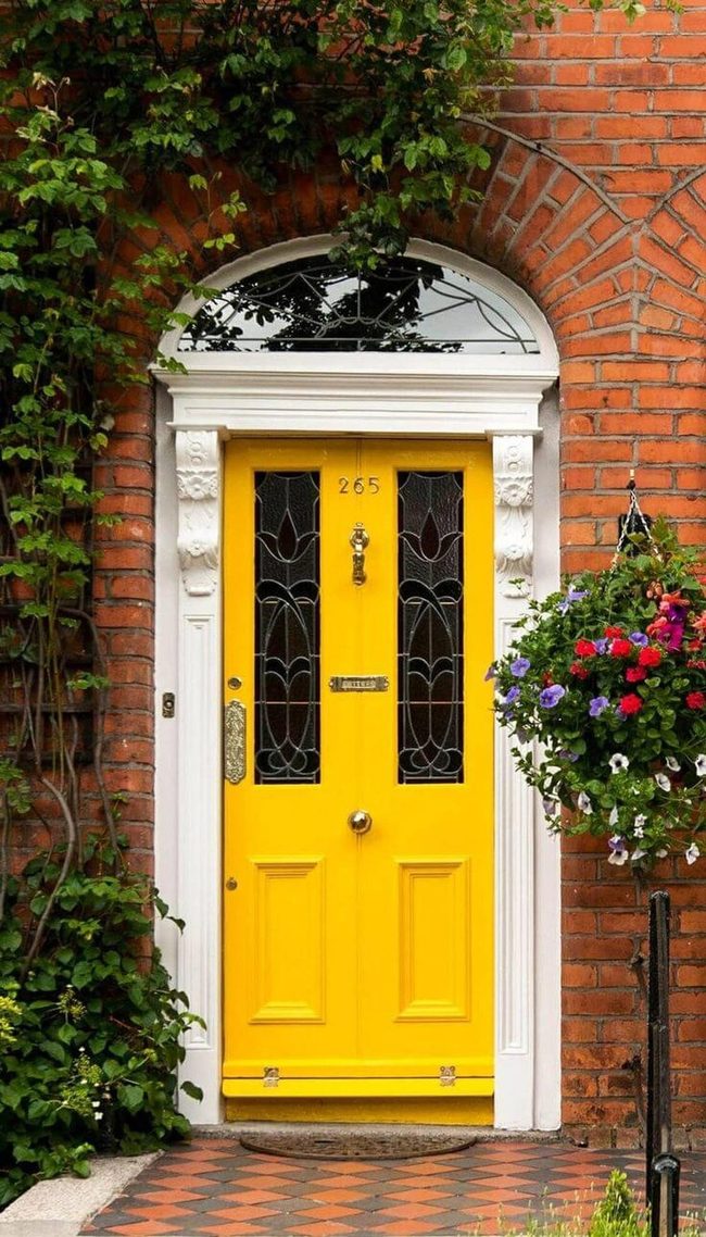
Your front entrance gets an instant boost from the bold yellow door that stands out against red brick and creeping ivy, proving that traditional homes can handle daring color choices without looking out of place.
The architectural elements surrounding the doorway draw attention through refined details like stained glass windows and a striking center doorknob that add character.
We think the sunny tone of that yellow really works because it brightens the whole facade and creates warmth that visitors feel the moment they arrive.
The contrast between the vibrant door and the classic brick backdrop shows how one brave design decision can transform a simple entryway into something people actually remember.
If you're worried about going bold with your own front door, this example shows you don't need to play it safe to look polished.
The mix of modern color and traditional materials proves that mixing styles together actually strengthens the overall look rather than clashing.
Emerald Door, Pale Gourd Accent
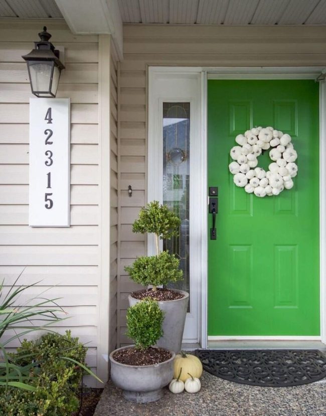
One bright green door becomes the star of your entry, and keeping other decorations minimal lets it shine without competition.
You can notice the same rich green shows up again in the stained glass window next to the door, which ties the whole entrance together through color.
A white gourd wreath hangs on that bold door and balances out all that vibrant green with its pale, natural tones.
This simple approach works because you're letting one strong visual element do most of the work.
The stained glass adds a second layer of interest without overwhelming the space.
When you step back and look at how these pieces relate to each other, the restraint actually makes the green door feel even more striking.
Keeping things spare and letting colors repeat naturally is often smarter than loading your entryway with too many different decorations.
Royal Blue Statement Entry
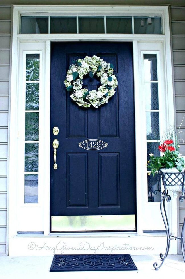
Royal blue front doors stop people in their tracks the moment they arrive at your home.
This rich, deep shade does double duty - it soothes the eye while also pairing beautifully with most house colors, especially pale gray exteriors.
You can add a wreath that echoes hints of blue to strengthen the overall appearance.
What makes royal blue so appealing is how it works across different seasons and styles without ever feeling out of place or dated.
Whether you hang greenery in winter or swap in warm florals come spring, this color handles every change you throw at it.
The shade manages to feel both timeless and modern at the same time.
Many homeowners find that royal blue doors become the perfect backdrop for whatever seasonal touches they want to add next.
Morgan Huxley
Founder & Creative Director
Expertise
Interior Design & Bold Décor Concepts, Creative Color Applications & Artistic Details, Budget-Friendly Styling, Sustainable Design Practices
Education
Parsons School of Design, New York, NY
New York Institute of Art and Design (NYIAD)
Morgan Huxley is a designer with a passion for bold interiors that feel personal and inviting. As the founder and creative director of [Brand Name], he helps homeowners bring color, texture, and personality into their spaces. With a degree from Parsons and a decorating certificate from NYIAD, he blends artistic expression with practical design solutions.
Morgan believes that great style shouldn’t be out of reach. He shares budget-friendly tips, sustainable ideas, and creative design tricks to make any home feel elevated.
When he’s not designing, you’ll find him exploring NYC’s art galleries, street murals, and food spots for fresh inspiration.